Your product probably does not look cheap because the idea is bad. It looks cheap because you presented it like a screenshot fell down the stairs and landed inside a rectangle.
A good device mockup fixes that fast.
The right premium mockups can make an app, website, SaaS dashboard, portfolio, landing page, or digital product feel more polished before anyone clicks a single button. Not because mockups are magic. They are not. They are just better framing, better context, and fewer crimes against visual hierarchy.
And yes, that matters. People judge quality before they understand features. Annoying, but true.
So let’s keep this practical.
Start with the right device
The device should match the product. Revolutionary, I know.
Use phone mockups for mobile apps, social features, checkout screens, onboarding flows, and anything designed for thumb-scrolling humans.
Use laptop or desktop mockups for SaaS dashboards, websites, landing pages, admin panels, and anything where people need to read, compare, manage, or pretend they are productive.
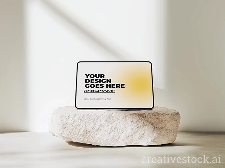
Use tablet mockups for portfolios, menus, presentations, educational apps, and visual-first products.
Use multi-device mockups only when responsiveness is the point. Not because you found one that looks fancy. Fancy is not strategy.
A computer screen mockup is great when your product needs clarity and authority. A phone mockup is better when speed, accessibility, or mobile experience is the selling point. Pick the device that tells the truth fastest.
Keep the background quiet
Premium design does not scream. It gives the product room to look expensive.
The background should support the product, not fight it. If your mockup has coffee cups, plants, notebooks, marble textures, sunglasses, cables, shadows, and a random hand entering from the side like a design crime witness, calm down.
Choose clean backgrounds: soft gradients, neutral surfaces, minimal desk scenes, studio lighting, subtle shadows, or abstract shapes that do not steal attention.
This is where AI-generated device mockups are useful. They can give you polished, controlled scenes without needing a photoshoot, props, lighting setup, or the emotional damage of arranging a fake desk for two hours.
The product should be the hero. The background should be the stage. If the stage is doing jazz hands, replace it.
Make the screen painfully sharp
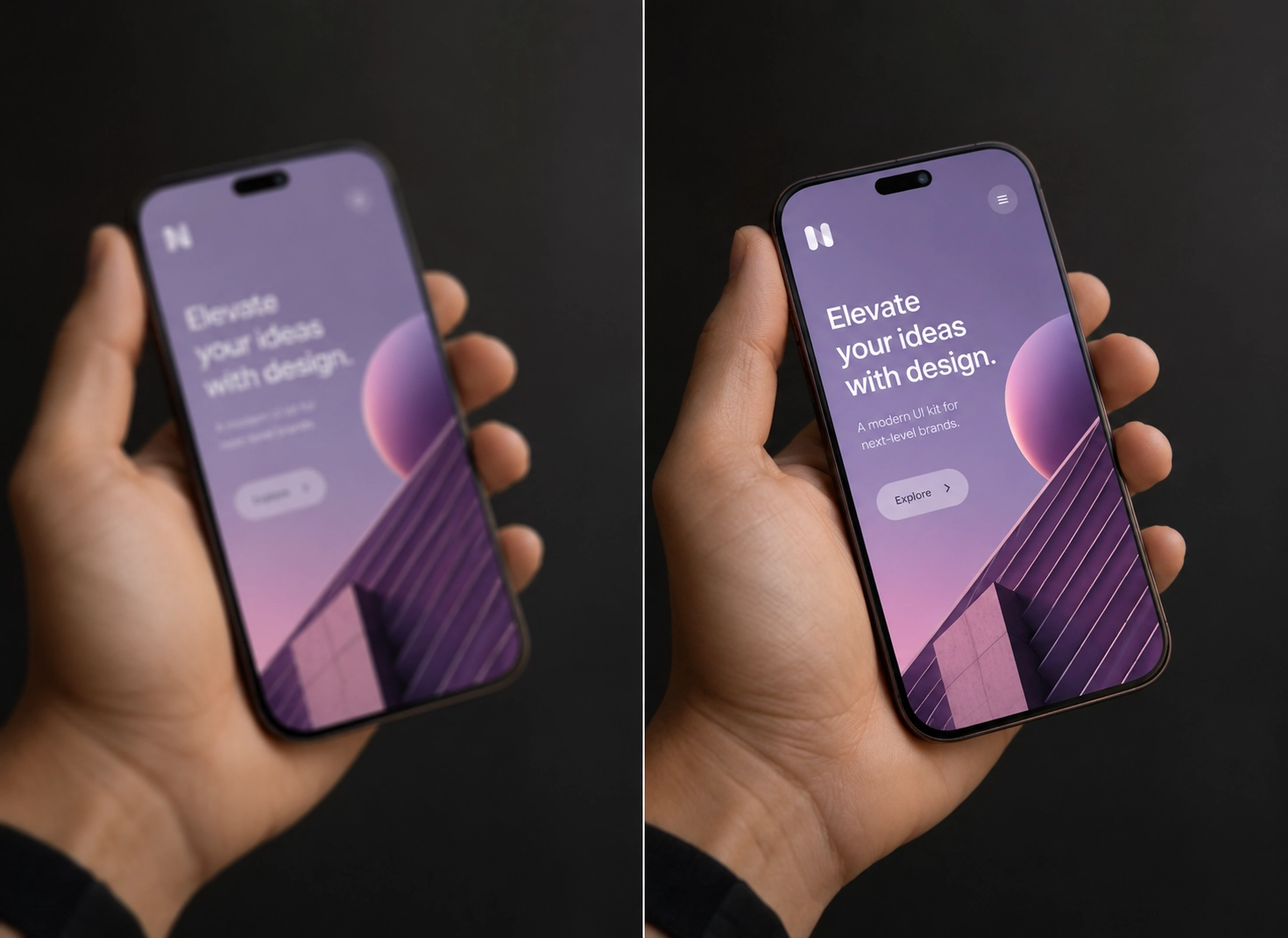
A blurry screen kills the premium effect immediately.
You can have the nicest device mockup in the world, but if the inserted UI is pixelated, stretched, misaligned, or slightly off-angle, the whole thing falls apart. Designers notice. Clients feel it. Users may not know what is wrong, but their brain quietly files it under “cheap.”
Before exporting, check the basics:
Is the UI crisp? Is the screen aligned with the device? Is the text readable? Are icons clean? Are colors accurate? Does the design fit naturally inside the frame?
Use high-resolution mockups whenever the visual will appear on landing pages, ads, pitch decks, portfolios, app stores, or product pages. Low-res mockups are fine if your goal is to look like you gave up. Otherwise, no.
Choose the mockup based on where it will be used
A landing page hero needs a clean, confident mockup with space around it. The visitor should understand the product in about three seconds.
A social media ad needs stronger contrast, a more dynamic angle, and a visual hook. People are scrolling like they are being chased. Be clear.
A pitch deck needs restraint. Use simple, polished device mockups that make the product look investor-ready, not like a nightclub flyer.
A portfolio case study needs consistency. Show the product in a few believable contexts, but do not turn the page into a mockup museum.
An app store or product preview needs readability first. Do not use dramatic perspective if nobody can read the actual screen. That is not premium. That is decorative nonsense.
The point is simple: every mockup has a job. Pick one that does the job.
Stop showing every feature at once
This is where many product visuals die.
You do not need to show the dashboard, onboarding, settings, pricing page, notifications, analytics, profile screen, and dark mode in one image. Nobody asked for a UI yard sale.
Pick one strong screen.
Show the feature that sells the product fastest. Maybe it is the dashboard. Maybe it is the checkout. Maybe it is the before-and-after result. Maybe it is the clean home screen that instantly explains what the product does.
One clear message beats six tiny screenshots every single time.
A good AI mockup makes your product feel real. A cluttered one makes it feel desperate.
If you need examples of cleaner product presentation, these free phone mockups for designers show how strong mockups guide attention instead of overwhelming the interface.
Keep the visual set consistent
One good mockup helps. A consistent set builds trust.
If one visual uses a black phone on a dark background, another uses a silver laptop on a bright desk, and the third has a tablet floating in neon smoke, your brand looks confused. Or worse, assembled from whatever downloads were left in the folder.
Premium brands feel intentional because every visual follows the same logic, color language, and presentation style - which is exactly why consistent visual branding matters across every mockup, landing page, and campaign asset.
Keep the style aligned.
Use similar lighting, background tone, device type, shadow softness, export size, and composition. Repeat your brand colors where it makes sense. Keep spacing clean. Do not switch visual styles unless there is a reason.
Premium is not always about adding more. Usually, it is about removing the things that make the work look accidental.
Use mockups to position the product, not decorate it
This is the part people miss.
A device mockup is not just a pretty wrapper. It tells the viewer how to feel about the product.
A minimal laptop mockup says: serious, clear, professional.
An angled phone mockup says: fast, modern, app-focused.
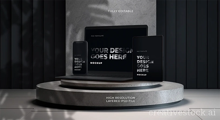
A multi-device mockup says: responsive, complete, ready to launch.
A close-up screen mockup says: look at this feature, it matters.
So before downloading a design mockup download, ask: what should this visual prove?
That the app is easy? That the platform is powerful? That the brand is premium? That the product is finished? That the interface is simple?
If the mockup does not support the message, it is decoration. Decoration is fine for birthday balloons. Less fine for product marketing.
Quick checklist before you publish
Before using your final mockup, check this:
- The device matches the product.
- The screen is sharp and readable.
- The background is clean.
- The lighting feels natural.
- The product is the main focus.
- The visual style matches the rest of the brand.
- The image communicates one clear idea.
The file is high-resolution enough for real use.
If you fail one of these, fix it. Do not “ship it and see.” That is how ugly landing pages are born.
Final take
Your product does not need more effects, more gradients, or another painfully dramatic floating screen mockup. It needs presentation that feels intentional.
The right premium mockups instantly make your product look more trustworthy, more polished, and more valuable - before users read a single word. Clean device scenes, sharp screens, realistic context, and consistent visuals are what separate “side project energy” from a product that actually looks ready to launch.
And honestly? In a market flooded with generic visuals, that first impression does a ridiculous amount of heavy lifting.
If your current product presentation feels flat, cluttered, or forgettable, fix the mockup first. It is usually the fastest visual upgrade you can make.
Explore the devices & tech mockup collection and give your product the kind of presentation that makes people stop scrolling and start paying attention.