You've got a client - nutritionist, meal prep brand, keto coach - and they want "something clean and healthy-looking." You open your usual sources and get forty shades of stock-photo avocado, Comic Sans-adjacent fonts, and color palettes that look like a 2009 smoothie bar.
Here's the question designers don't want to ask out loud: Is my design bad, or is my source material just terrible?
More often than it should be - it's the second one.
Healthy eating content has a visual credibility problem. The category drowns in generic "green = healthy" logic, flat illustrations that signal nothing, and layouts built for someone who's never had to get client approval. If your presentation looks like a waiting room poster, the client won't say "the template is bad." They'll say "I just don't feel it." Then you spend three rounds trying to fix something broken from the start.
Good templates don't just save time. They give you a direction that doesn't need explaining in every meeting.
What Separates Usable Templates From the Rest
Before the list - a quick filter. A template earns its place when it does at least one of these things:
Communicates restraint. Healthy brands don't shout. The best ones use whitespace, clean type, and minimal color. If a template is competing with itself visually, skip it.
Has hierarchy baked in. Product name → benefit → CTA, in that order - not "a collection of elements." The template should answer "where does the eye go first?" before you've changed a word.
Editable without archaeology. Layers named "Layer 47 copy 3" inside smart objects inside clipping masks are not assets. They're a time tax.
Fits real output formats. Instagram post, story, flyer, banner - not a 2400×3600px canvas that nobody exports correctly.
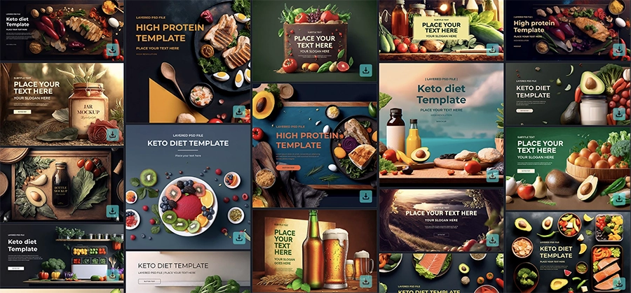
Top 10 Keto and Healthy Diet Design Templates
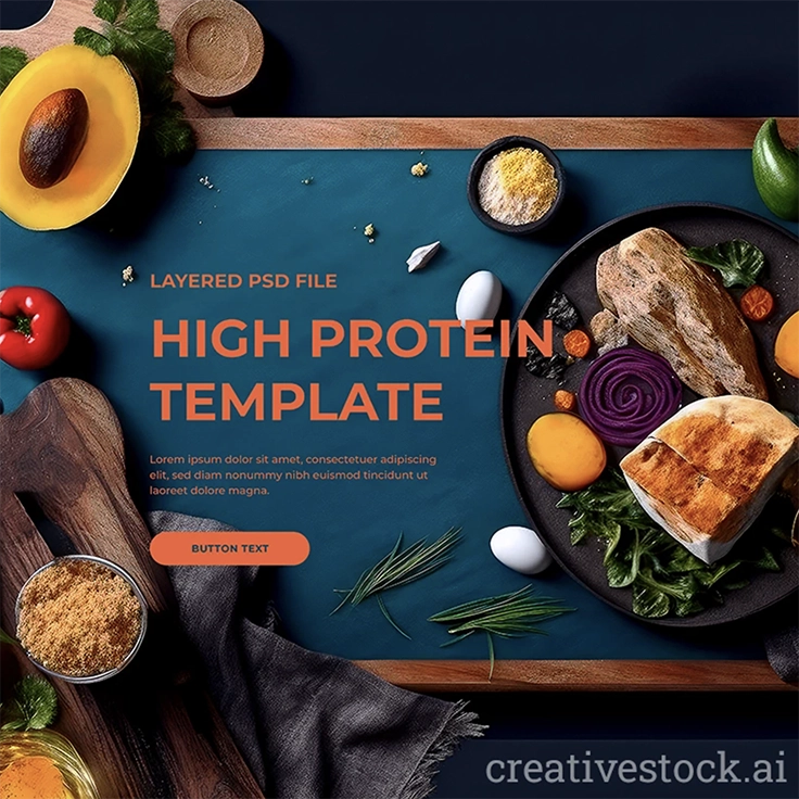
1. Protein Diet: Meat & Veggies - Rustic Plate Design
A dark plate, sauces, utensils - built for premium protein-focused brands that can't afford to look like a supplement flyer. Use it when the brief is "elevated healthy eating" and you need something that reads restaurant-quality without the photography budget. The rustic staging adds warmth that keeps it approachable.
2. Keto Diet Banners
A banner-focused collection built specifically around the keto category - which matters, because generic food banners rarely carry the macro-conscious visual logic that keto branding requires. The browser-based editor makes it a practical handoff option for clients who'll be managing their own content between your touch-points. You design the direction once; they execute it without destroying it.
3. Protein Diet - Vibrant Plate with Fresh Veggies
Where the rustic plate goes dark and moody, this one goes bright and fresh - eggs, vegetables, bread on a wooden cutting board. Two different visual registers, same category. That's exactly what you need when managing multiple clients in the same niche: both templates live in your toolkit without one cannibalizing the other.
4. Healthy Food Banner Template PSD Set
A multi-format banner set covering Instagram, story, and restaurant social media posts in one download. Rawpixel's licensing terms are cleaner than most platforms - no buried attribution exceptions - which makes it a reliable source when client work requires clear usage rights. The design is light, food-forward, and works without adjusting the visual logic across formats.
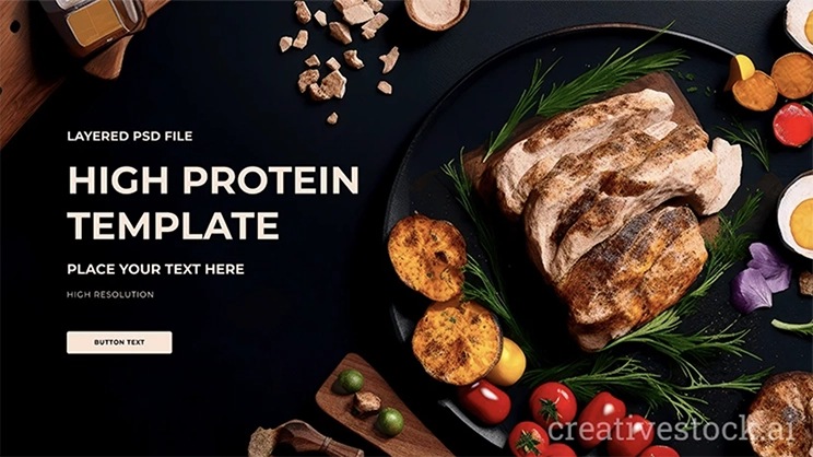
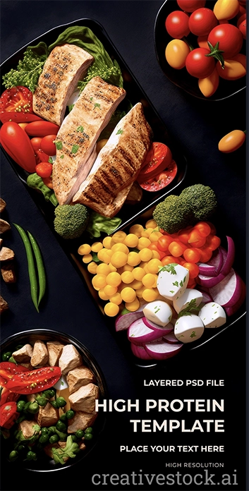
5. High Protein Diet - Black Plate Meal Template
Black plate, meat, vegetables, fruit - designed as a balanced meal visual for high-protein positioning. The dark background does the heavy lifting: it communicates premium without requiring the designer to engineer that feeling from scratch. Practical for gyms, personal trainers, or meal prep brands that need to look intentional, not amateur.
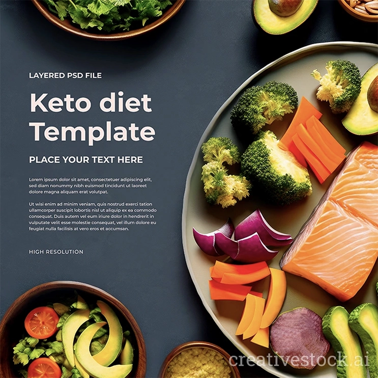
6. Keto Diet: Salmon & Broccoli Bowl
Salmon, broccoli, carrots, avocado - this is the template for clients who want "clean eating" to look like an actual meal, not a stock photo composite. The bowl composition is the format that performs best on nutrition-focused accounts right now, and this one is staged to look credible rather than decorative.
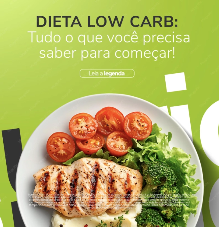
7. Low Carb Diet
This one is built for the explainer format - a structured visual that walks through what low-carb eating actually means before trying to sell anything. Most diet content skips this and wonders why the conversion rate is flat. If your client is in the awareness or education phase, this is the template category that matches that intent. Premium asset.
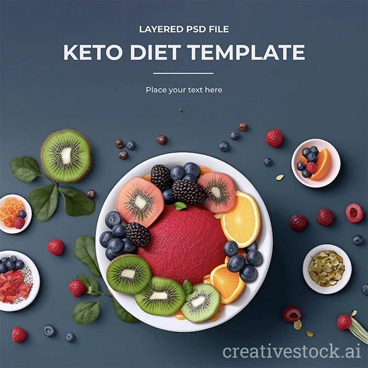
8. Keto Diet Template - Vibrant Fruit Bowl Design
Kiwi, oranges, blue surface, black background - high-contrast, high-energy. Works for keto brands that want to lead with color rather than neutrals. Useful as a campaign hero image, social post, or product packaging visual when the client brief is "bold" rather than "clean."
9. Grilled Pork Steak Design Template
Protein-forward, direct, no apologies for the meat. This is the template for clients who cater to carnivore-leaning or high-protein diet audiences - a segment that's been underserved by the avocado-and-smoothie aesthetic that dominates most healthy food template libraries. The layout is clean enough to work across social and print without modification.
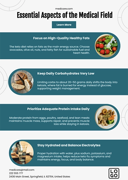
10. Keto Nutrition Infographic Template
Built for the deliverable that usually gets treated as an afterthought: the "here's what keto actually means" explainer that a client posts, emails, or hands to a new audience. Macro ratios, approved foods, diet tips - structured in a scannable infographic layout. Not a social post template. This is the thing you build once and that the client uses for the next six months.
How to Pick the Right One
The mistake is format-first thinking - asking "what do I need, flyer or post?" before asking "what does this brand need to communicate, and at what stage?"
A keto coach launching a program needs authority and specificity: macro breakdowns, controlled color, nothing that reads generic. A meal prep brand promoting a weekend offer needs speed: bold headline, food photography slot, clear CTA. Different problems. Different templates.
If the work needs to run consistently across weeks, prioritize modular layouts where swapping the image and headline keeps the visual identity intact. That's where CreativeStock's food category earns its place: templates designed to repeat without looking repetitive.
If the deliverable is a pitch, a proposal, or a client-facing PDF, go format-specific. The infographic and explainer formats exist for exactly this - when design has to carry information, not just atmosphere.
The Honest Takeaway
The healthy eating design space is full of templates that all learned from the same Pinterest board. The ones worth using share one trait: they were built for a specific job.
Pick based on the deliverable. Pick based on what the client can actually maintain after you hand off the files. And if you need a library that scales - not just a one-off asset - start with templates built for consistency from day one.