Let me ask you something uncomfortable. You spent three hours on a brand identity. Colors locked. Typography nailed. The client loved the pitch. Then they said: "Can you just use that Canva template for the social posts?"
And somehow you said yes.
That's where it starts.
The Template Trap Nobody Wants to Admit
Templates aren't evil. Let's get that out of the way. A template is a tool. A hammer isn't responsible for a bad house.
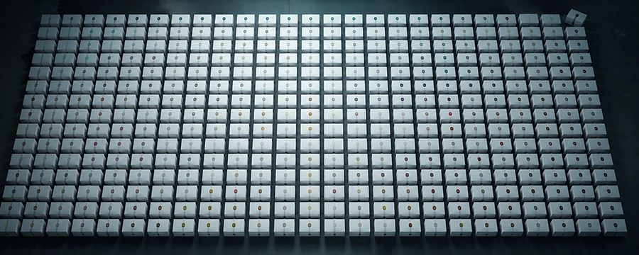
But here's what's actually happening in 2026: designers, marketing teams, and brand managers are collectively reaching for the same 40 templates, swapping out logos and hex codes, and calling it a brand identity. Then they wonder why their launch campaign looks vaguely familiar. Why the Instagram feed feels like it belongs to their competitor. Why clients keep asking for "something that pops."
It pops. You've just seen it 300 times before.
The problem isn't using templates. The problem is using templates as thinking. If you're looking for a starting point that doesn't lock you into someone else's decisions, Download Free Mockups and Templates - CreativeStock.ai is worth bookmarking before you read further.
What Brand Identity Actually Means (Remind Yourself)
A brand identity is a decision system. Every visual choice - color, spacing, typeface, layout - communicates something specific about who this company is, what they stand for, and who they're talking to.
When you pick a template, someone else made those decisions. For a generic audience. For no specific company. Optimized for looks-okay-at-a-glance, not for this brand, this customer, this moment.
You're not customizing a brand identity. You're inheriting someone else's communication strategy.
And that strategy? It was designed to work for everyone - which means it's perfect for no one.
This isn't a fringe take. As designer and writer Jarrett Fuller documented in his widely-read analysis of why everything online looks the same, companies including TikTok, Google, and Airbnb have each released "bespoke" fonts that are functionally identical - slight variations on the same neutral grotesque baseline. Even bespoke is getting templated.
The Homogenization Math
Here's the thing about shared toolkits with shared defaults: the output converges. That's not cynicism - that's math.
Two brands in the same industry, same target market, both using "clean modern templates" - they look like subsidiaries of the same holding company. Customers can't tell them apart. Brand managers wonder why conversion is flat.
Design researcher Stewart Dean at Design Sojourn identified this pattern years ago: when designers reach for the same visual influences, the same briefs produce the same outputs. The brief doesn't have to be lazy - the cognitive shortcut is baked in. You see something that "works," you approximate it, the market fills with approximations.
The result in 2026? A landscape where differentiation is the exception, not the baseline.
The Real Issue: Templates Replace Thinking, Not Labor
Here's the thing nobody says in the briefing room: templates are supposed to save production time, not replace brand strategy.
If you know exactly who you're talking to, what emotional territory you own, and what visual language reinforces that - a template can be a starting point. You'll gut it. You'll rebuild. The template is scaffolding, not architecture.
But most teams use templates because they haven't done the thinking. The brief was vague. The timeline was short. The client "just needs something for the launch." So you grab a template, it looks professional enough, and everyone moves on.
Until six months later when the brand feels hollow. When the audience doesn't connect. When the CEO says "it looks corporate but I'm not sure why."
That's the bill coming due.
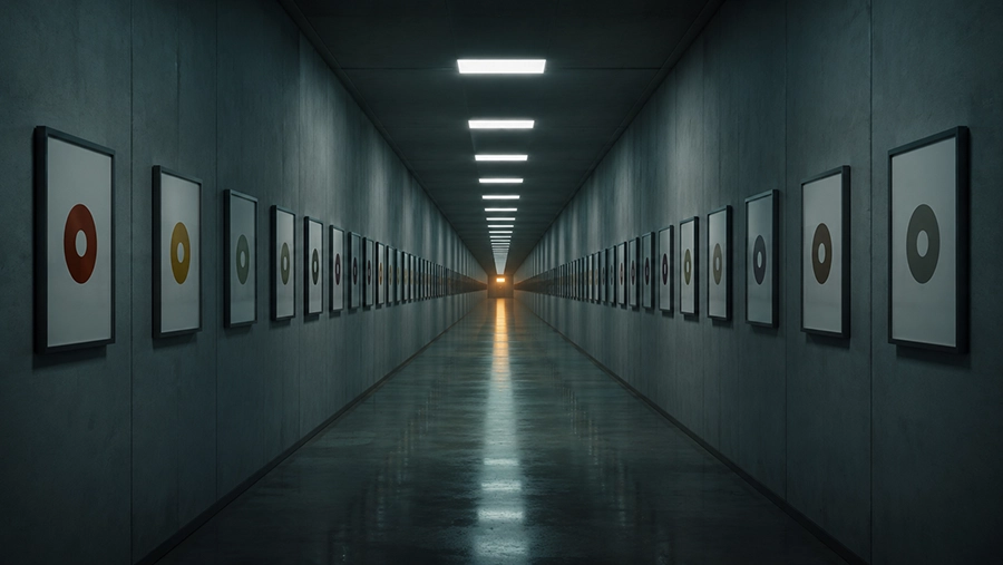
What Differentiated Brands Actually Do
The brands that consistently look distinct - not trendy, not loud, just unmistakably themselves - have one thing in common: they made deliberate choices at every level.
Not just logo. Not just color palette. The way space is used on a page. The weight of a headline versus body copy. Whether photos are warm or cold. Whether layouts feel tight or breathing. Whether they use motion or stillness.
These are communicative choices. They aren't about being different for its own sake - they're about being accurate. About the visual language matching the actual brand personality.
And the business case for this is not soft. McKinsey's research across 300 publicly listed companies found that top design performers grew revenue at nearly double the rate of their industry peers. That's not aesthetic preference - that's compound differentiation working over time.
A premium skincare brand and a direct-to-consumer gym supplement both might use "minimalist design." But their minimalism should feel nothing alike. One is quiet luxury. The other is stripped-down intensity. The template doesn't know that. You do.
The Presentation Problem
There's a related issue that compounds all of this: even when the design is good, it's presented badly.
A designer does solid work. The mockup they show the client is a flat screenshot on a white background. The client can't feel the work in context. They can't see it on a phone screen, on a billboard, on packaging. So they fall back on what they know: "Can we make it look a bit more like [competitor]?"
Bad presentation creates doubt. Doubt creates interference. Interference kills good design.
This is where contextual mockups stop being a portfolio trick and start being a strategic tool. Showing a brand identity in the world - on devices, on print materials, in real environments - closes the gap between the designer's vision and the client's imagination. Free Branding Mockups - CreativeStock.ai shows what in-context presentation actually looks like.
When clients can see it, they stop asking for copies of something else.
The Fix Isn't "Never Use Templates"
The fix is using templates the way experienced designers do: as raw material, not finished product.
Take the grid. Break it somewhere. Change the type hierarchy to match the actual brand voice. Use the template to handle the parts that don't communicate - and build the parts that do, from scratch.
More importantly: build the habit of asking why before grabbing anything. Why does this layout exist? What problem does it solve? Is that the same problem this brand has?
For print and packaging specifically - where spatial decisions are irreversible - Free Print Mockups - CreativeStock.ai lets you stress-test those decisions before they go to production. Not as decoration. As a thinking tool.
If the answer is no - start from there.

The Uncomfortable Truth
Every brand that looks generic chose to look generic. Not always consciously. Not always intentionally. But somewhere, someone decided that good enough was enough.
And good enough compounds. A slightly-generic social post becomes a slightly-generic campaign. A slightly-generic campaign becomes a slightly-generic brand perception. And brand perception is the hardest thing to reverse.
You can't A/B test your way out of invisible.
The antidote is the same it's always been: do the thinking. Make the choices. Earn the distinctiveness. And then - for the love of everything - present it properly.
Your work deserves context. Give it some. Free Design Templates - CreativeStock.ai.