 A poster lands on a white canvas. The client sees a rectangle with colors and text. They say "let me think about it" - the sentence that means the presentation failed, not the work.
Wall art approval breaks down almost every time for the same reason: the design is shown without a room. The brain needs spatial context to make a commitment. Scale against furniture, light behavior, ambient mood - these aren't decoration details, they're decision drivers. Without them, even a strong design looks theoretical.
Interior poster mockups build the room. The wrong one - bad scale, plastic lighting, furniture that fights the design - still fails. The right one closes the conversation in the meeting. This is a ranked list of ten free interior mockups specifically for living room scenes. Five are from CreativeStock Print Materials Mockups, five from external sources, every link goes directly to the download page.
What living room poster mockups actually need to get right
Three things. Most freebies miss at least two.
Scale against furniture. A frame that reads as a decorative detail instead of a statement piece makes the design feel small before anyone looks at it. The poster needs to command the wall - not sit politely beside a lamp.
Lighting logic. Interior scenes live and die on this. Hard studio shadows in a domestic room break immersion immediately. Soft window falloff, ambient room glow, realistic shadow depth - that's the difference between a render and a photograph.
Scene-to-work match. Nielsen Norman Group's research on first impressions shows that visual quality judgments form in roughly fifty milliseconds. The room around the poster makes that judgment before anyone reads a single element of the design. A warm, layered living room positions art differently than a clinical white space. Choosing the wrong scene type for the work is as damaging as choosing the wrong typeface.
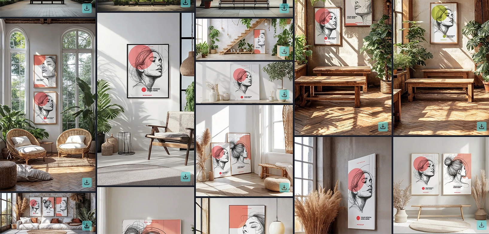
#1 - CreativeStock: Wicker Chairs, Rugs & Sunlit Windows
This sits at the top because it handles the most common approval situation: a client who lives in a real home and needs to picture the work on a real wall. Wicker chairs, layered rugs, lush plants, natural light through sunlit windows - the scene has enough warmth and personality to be convincing without competing with the design. The poster is centered, breathing room on all sides.
Personal and commercial license included. The scene works hardest for lifestyle brands, home decor clients, and art print launches - anywhere the brief has warmth built into it. It's also the safest pick when the client isn't a designer: the familiar domestic setting does the translation work so you don't have to explain what the piece will "feel like on the wall."
#2 - Mockup World: Three Frames on Living Room Wall
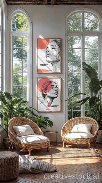
Three frames, smart layers for each, full control over couch, wall, and rug colors. When the brief is a print series or a campaign suite, presenting pieces in isolation leaves the visual relationship between them unexplained. Three frames in one consistent scene does that work without a word of copy. The spatial arrangement makes the argument.
For illustrators launching print sets, anyone presenting a thematic series, or any project where "how they sit together" is part of the pitch - this is the correct format.
#3 - CreativeStock: Couch, Potted Plants & Framed Pictures by Window
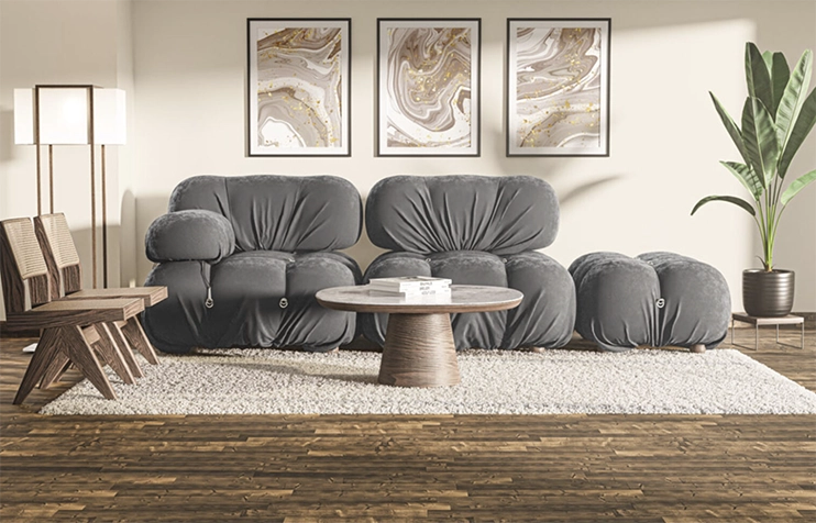
Where #1 reads as warm, this one reads as inhabited. A couch, a rug, potted plants, and secondary framed pictures alongside the hero frame - the composition signals that someone with real taste lives here and already owns art. That context elevates the hero piece without any rationale paragraph required.
The secondary frames are doing quiet work in the background - they signal that this space already has a collection, and the hero piece belongs in it. That's a different argument than "here's your poster." For clients who own art, run interior businesses, or need to see the work positioned as a considered choice rather than a purchase, this scene closes faster than anything else on the list.
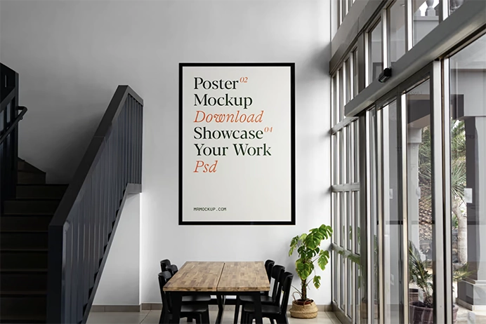
#4 - Mr.Mockup: Poster in Living Room on Wall
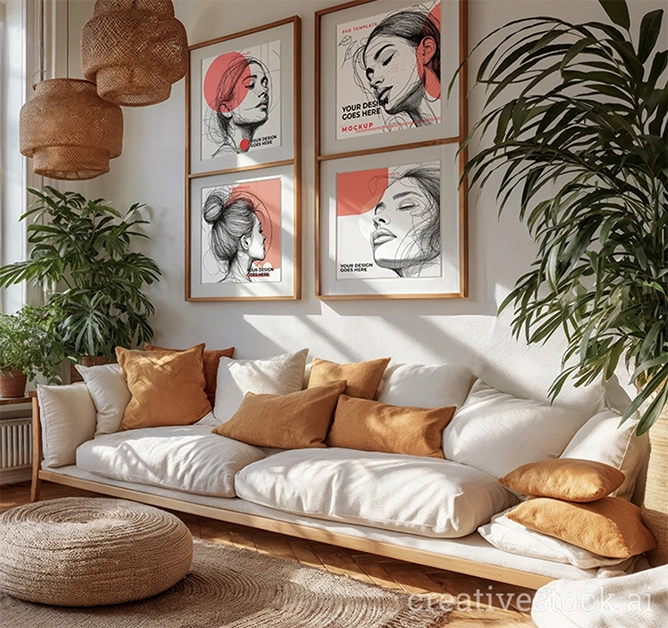
Mr.Mockup is a consistently high-quality freebie source, and this entry earns its place through restraint. Front-facing frame on a clean white wall inside a flat, smart object layer, zero visual noise. Whatever goes into the smart layer owns the full frame of attention. The absence of personality in the scene is a feature, not a limitation.
Use this when the design is complex, high-contrast, or visually loud - abstract typography, bold illustration, photography with strong color. The neutral container lets the work do all the talking.
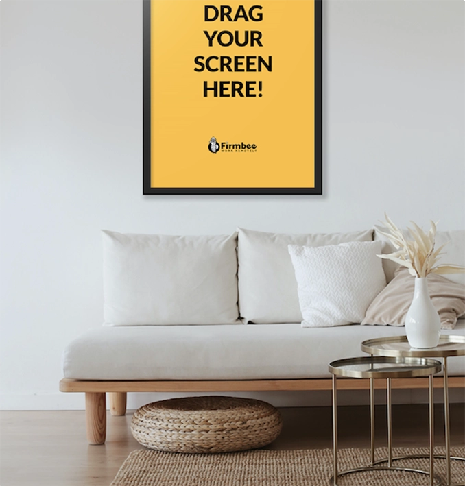
#5 - Firmbee: Poster in a Modern Living Room
CC0 license - copy, modify, distribute, use commercially, no attribution required. Modern living room, fully layered PSD, smart objects, two-poster variation on the same page. Direct download, no account, no checkout step.
For freelancers working under a deadline who need to drop a design in and send a deck in under ten minutes, this is the lowest-friction option on the list. Not the most sophisticated scene, but the most permissive license and the fastest path from file to presentation.
#6 - CreativeStock: Cozy Living Room with Elegant Decor Elements
This is the everyday approval scene - the one that works across client types without requiring adjustment. Cozy living room, couch, rug, elegant decor accents, framed poster. Enough visual character to feel real, not enough to fight the work.
Personal and commercial license included. The scene has no strong visual agenda - which is exactly the point. It accommodates abstract work, editorial typography, botanical illustration, lifestyle photography without pushing back against any of them. When you're not sure which scene fits the work, this one fits the work. That makes it the most-reached-for file in the collection for good reason.
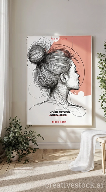
#7 - CreativeStock: Serene White Room with Minimalist Decor
White rooms are the gallery standard because they make color pop, type read clean, and photography look editorial. This scene uses a white frame, a plant, a chair with a blanket, and a white rug - minimal without being sterile. The room says art comes first here, before the design even loads.
Smashing Magazine's editorial on design and presentation consistently makes the case that environment shapes perceived quality - this scene delivers that automatically. Reach for it when the work needs to read as premium before anyone examines it closely: fine art prints, photography portfolios, typographic posters, anything where the brief uses the word "gallery" or "editorial." The white room doesn't add personality - it removes obstacles.
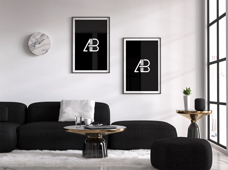
#8 - Mockup World: Living Room with Two Poster Frames
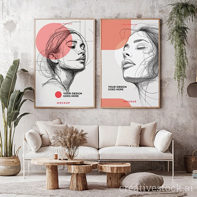
Two frames, cozy interior, smart layers for both. The dual-frame composition does one specific thing better than any single-frame scene: it shows the visual relationship between two pieces. A diptych needs to be seen as a diptych. Two prints in a series need to sit together before the client understands why they belong together.
For photographers presenting paired work, illustrators with coordinated prints, or any project where the brief is "these two live on the same wall" - this is the right file.
#9 - CreativeStock: White Frame on Wooden Dresser Near Window Sill
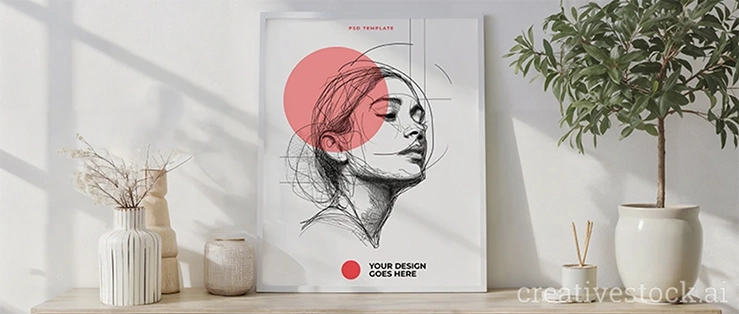
Most interior mockups treat the wall as the entire composition. This one doesn't. The frame sits on a wooden dresser alongside a plant and a candle holder, with window sill light providing the background. The result is an intimate, styled scene - less gallery, more carefully curated home corner.
Personal and commercial license included. This is the right file when the poster is part of a story, not the whole story. Interior designers presenting a complete room concept, brands building lifestyle campaigns, or any project where the art sits inside a curated moment rather than dominating a wall - the dresser, the plant, the candle, the window light all do that contextual work. It changes the frame of the conversation from "do you like the poster" to "do you like how this room feels."
#10 - Free Mockup World: Free Interior Poster Mockup PSD
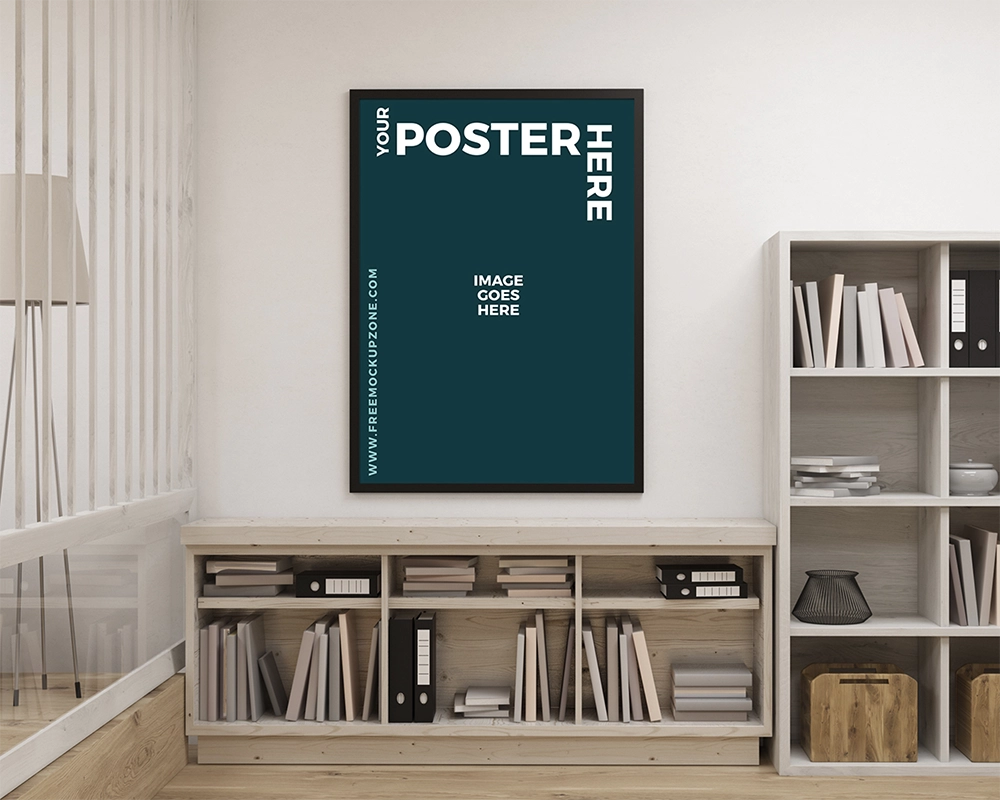
Free Mockup World is a dependable source for designers who need reliable freebies without burning time on aggregator lists. Smart object layer, photorealistic interior setting, clean scene, direct download. No unnecessary friction between finding the file and using it.
Closes the list as a solid fallback for any living room presentation that needs a quick turnaround. Not the most distinct scene, but it works, it's free, and it's ready.
How to match the mockup to the brief
This is a tool decision, not a style preference. It comes down to who's in the room and what they need to see.
Client meetings with homeowners or interior clients - #1 or #3. The layered, warm, lived-in scenes land with non-designer audiences faster than anything else on this list. They complete the picture the client couldn't complete on their own.
Fine art and editorial presentations - #7 or #4. The white room and the clean minimal frame both position the work as gallery-grade. The visual language makes the case before anyone reads the rationale.
Print series and campaign suites - #2 or #8. Three frames or two frames in one consistent scene shows the spatial relationship between pieces in a way no sequence of individual slides can replicate.
Fast turnaround with zero friction - #5. CC0, drop in, send.
For more living room scenes and the full interior print collection, browse CreativeStock Print Materials Mockups. For the wider stack - devices, outdoor, apparel - the guide to the best mockup sites for designers covers the full landscape.
The dark question designers won't ask out loud
Here it is: is the client rejecting the poster, or the room it never had?
Most designers never find out because the feedback arrives as vague hesitation and gets interpreted as a design problem. The work gets revised. The revision gets presented in the same blank white canvas. The client hesitates again. The real issue - no context, no room, no scene - never gets addressed.
Put the work in the right room and the same client commits in the same meeting. That is not a presentation trick. That is the entire approval dynamic.
Final word
Ten mockups, one point: the scene is not the background. It is part of the work.
Pick the room that fits the brief. Drop in the design. The conversation gets shorter every time you do.