Most poster presentations fail for one boring reason: the artwork sits on a bright white wall and disappears into it. If the design is already dark, atmospheric, or type-heavy, that scene works against you. A dark frame mockup does the opposite job — it drops the background luminance, lets a single warm light source do the talking, and pushes the poster forward instead of flattening it. All the scenes below live in our free mockups library as editable 4K PSD files, so you can test the same artwork across nine moods in an afternoon.
Why dark scenes make a poster look more expensive
Low-key lighting is not a style choice here, it is a contrast tool. When the surrounding room is dark, the eye has nowhere else to go, so the brightest area in the frame wins attention by default — and that brightest area is your design. It also hides everything you do not want judged: wall texture, room clutter, the fact that the scene is a mockup at all.
Three things separate a convincing dark scene from a muddy one. The light source has to be visible or implied (a candle, a lamp spill, a window edge), the shadow under the frame has to be soft rather than a hard black blob, and there needs to be exactly one characterful object nearby — a book stack, a plant, a glass jar — so the scene reads as a real room instead of a studio void.
Candlelit table and shelf scenes
These are the safest starting point for book covers, poetry posters, event invitations, and anything with serif typography. The warm falloff around the candle gives you a natural vignette without touching a single adjustment layer.


Black and gold frame scenes
When the client wants "premium" without saying what that means, this is the shortcut. Gold trim against a near-black background reads as luxury instantly, which makes these scenes useful for perfume, jewellery, spirits, and anniversary campaigns. Keep the artwork itself restrained — the frame is already doing the shouting.


Mystical forest and outdoor scenes
These break the studio feel entirely. Moss, low fog, and filtered daylight give you a fantasy-book atmosphere that works for album art, festival posters, game key art, and any brand leaning into folklore. Because the background has real depth here, keep your design high-contrast or it will sink into the foliage.


How to drop your artwork in
Every scene ships as a layered PSD with the display area built as a smart object. Double-click the smart object thumbnail, paste your poster inside, save, and the parent file updates with the scene lighting and perspective already applied — Adobe's own smart object documentation covers the mechanics if you have not worked this way before.
Two habits that separate a clean result from an obvious paste job. First, match your artwork's black point to the scene rather than dropping in a pure white background — in a candlelit room, nothing is #FFFFFF. Second, leave the overlay and shadow layers alone. They are the reason the frame looks like it belongs in the room, and flattening them is the fastest way to make a mockup look fake.
Which scene for which client
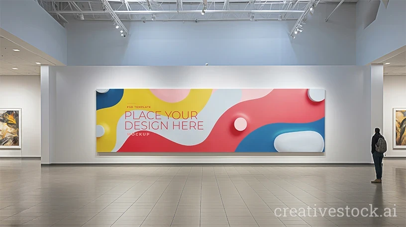
Dark scenes are not a universal upgrade. If the artwork is minimal, pastel, or aimed at a lifestyle audience, a bright room will serve you better — that is what the interior poster mockups for living room scenes are for. If you are presenting an art series or a curated collection, an exhibition setting carries more authority than a table top, and the museum and gallery exhibition mockups handle that case.
Use the dark set when the work is atmospheric, when the brand sits in the premium or narrative space, or when you need one hero image that stops a scroll. The rest of the print family — flyers, brochures, business cards — lives in print materials mockups, and a mixed board of two dark scenes plus one neutral one usually reads better to a client than nine variations of the same mood. You can see how the full sets are packaged on our Behance profile before you download.
License and download
All nine scenes are free to download in 4K editable PSD, usable for personal and commercial client work. Check the specifics in the license agreement before you ship anything to a paying client.
Pick two scenes with different light sources, run your poster through both, and put them side by side. That single comparison usually settles the direction faster than another round of feedback. Start with the free mockups collection and build your presentation board tonight.