Nobody approves a campaign because the artboard looked nice. They approve it because, for two seconds, they believed the ad already existed on a street they recognise. That is the whole trick behind a good billboard mockup — it moves a flat file into the physical world, at a scale the client can feel.
Outdoor is also the format where a weak presentation costs the most. Print, packaging and social all get a second look. A street billboard mockup either lands immediately or the room starts talking about the photograph instead of the campaign.
Why outdoor mockups change the conversation
Scale stops being theoretical. Passing cars, a bench, a pedestrian, a traffic light — these are not decoration. They are the measuring stick that tells a client whether the headline still reads at forty metres or whether the logo has quietly become invisible.
Context sets the budget expectation. A vintage street sign scene reads as local and independent. A large illuminated screen in a city centre reads as a national buy. The room forms an opinion about the money behind the campaign before anyone speaks.
Environment tests the design honestly. Real streets are cluttered. Dropping the layout into a scene with greenery, buildings and reflections exposes low contrast, thin type and cropping problems that a white background politely hides.

Pick the scene that matches the media buy
Street-level sign with traffic
The workhorse. Use it for local business campaigns, openings, retail promotions and anything where the audience is on foot or in a car within a few metres of the panel. Because the viewer is close, this scene rewards detail — a phone number, an address, a QR code all stay legible. Choose it when the client needs to see that the practical information survives.

Subway and transit poster
Transit is a captive-audience format, and the mockup should show it. A subway poster mockup with a platform bench and ceiling lighting communicates dwell time: people stand in front of this panel for minutes, not seconds. That justifies more copy, a longer proposition, a denser layout. If the client is questioning why the campaign has so much text, this is the scene that answers the question for you.

Night and illuminated city billboard
Backlit and night scenes are the premium tier. Light coming from the panel rather than falling onto it flatters saturated colour, deep backgrounds and anything with a luxury or entertainment tone. It is also the most unforgiving option: pale artwork with a lot of white will blow out and look cheap. Reserve it for designs built on contrast.

Large indoor signage and display walls
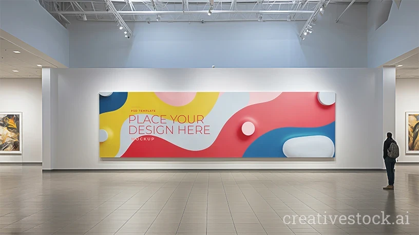
Airports, malls, stations, lobbies. These scenes sit between exhibition and outdoor: architectural scale, controlled lighting, clean surroundings. Useful when the same artwork has to serve a campaign and an environmental branding conversation in a single deck.
Four mistakes that make outdoor mockups look fake
1. Killing the overlay layers. The artwork looks darker inside the scene, so the shadow and light layers get switched off. That darkening is the realism. Brighten the design inside the smart object instead, never by disabling the scene's lighting.
2. Pasting low-resolution artwork. These scenes run at 4K and above, at 300 DPI. A small JPG scaled up will show every artifact the moment the file is exported, and a client who spots it once will not trust the next preview.
3. Ignoring colour temperature. Cool artwork in a warm-lit street scene reads as pasted in. A light photo filter on the artwork layer, matched to the ambient light, fixes it in seconds.
4. Sending five variations of the same idea. Multiple scenes for one concept invite the client to critique the street instead of the campaign. One scene per concept, chosen deliberately.
What to check before the file goes to production
A mockup proves the idea; it does not prove the artwork will print. Before the campaign leaves your hands, run the checks the mockup cannot do for you: real-world dimensions and viewing distance, safe margins for the frame that will hold the panel, CMYK conversion with the printer's profile, and minimum type size at final scale. Large-format printing is also more forgiving of resolution than designers expect and far less forgiving of thin strokes — a hairline rule that looks elegant on screen can disappear entirely at six metres.
One more thing worth saying out loud in the meeting: an outdoor mockup is a presentation device, not a photograph of an installed campaign. If there is any chance the client thinks the panel is already booked and printed, correct it before approval rather than after.
Download free billboard and street mockups
Every billboard and street scene on CreativeStock is a fully editable PSD with smart objects, 300 DPI, 4K and above, with a personal and commercial license included. Free to download after registration — no watermark, no per-file payment, no subscription.
Browse the free billboard and outdoor mockup collection →
Presenting artwork in a cultural or exhibition context instead? See our free museum and gallery mockups. For interior scenes, browse the free interior poster mockups, or go straight to all print material mockups.