A poster on a white background is a file. The same poster hanging on a gallery wall, with a visitor standing in front of it and light falling across the floor, is a proposal. Clients do not buy files. They buy the moment when they can picture the thing existing.
That is the entire job of a museum mockup or gallery mockup: to move your work out of the abstract and into a room someone can imagine walking through. Exhibition posters, art prints, cultural branding, print-on-demand wall art, festival campaigns — all of it lands harder inside a gallery scene than on a blank artboard.
Why gallery mockups convert better than flat previews
Three things happen the second you drop artwork into an exhibition scene.
Scale becomes readable. Nobody can judge whether a piece should be printed at A2 or at three metres wide when it floats on white. Put a human figure in the frame and the answer is immediate — that is why so many strong gallery display mockups include a visitor.
Context sets the tone. A minimal white-cube room reads as contemporary and serious. A room with tall illuminated windows and reflections reads as premium and architectural. You are not just showing the artwork, you are telling the client what kind of institution it belongs in.
Light does the persuading. Shadows, floor reflections and directional light are what separate a believable exhibition render from an obvious paste-in. This is also where most free mockups fail — flat lighting, no shadow pass, artwork sitting on the wall like a sticker.

Which gallery scene for which job
The spacious room with multiple walls
Use it when you are presenting a series, not a single piece. Multiple hanging positions let you show how a collection reads together — rhythm, palette consistency, whether the set survives being seen at once. Ideal for exhibition proposals and portfolio case studies.
The large white display wall
One artwork, maximum impact. This is the format for a hero shot: a single exhibition poster mockup at architectural scale, a visitor for reference, hard shadows for drama. Best for the opening slide of a pitch and for social announcements where you have one image to make the point.
The room with illuminated windows and reflections
Reflections signal budget. A modern setting with glass, light spill and reflective flooring makes the same artwork feel like it belongs to a funded institution rather than a pop-up. Use it for cultural clients, luxury brands and anything where the room needs to carry as much weight as the work.

The exterior or architectural backdrop
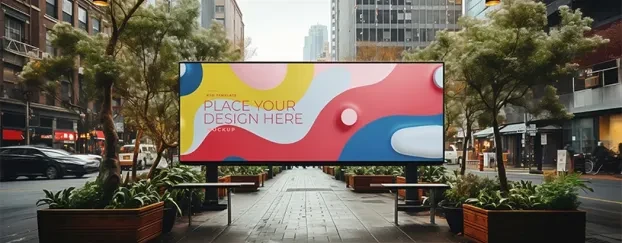
Ultra-wide scenes with sky and building context bridge gallery and outdoor advertising. Useful when the same artwork has to work as both an exhibition graphic and a large-format street campaign, and you want one image that covers both conversations. If the campaign side is the real brief, pair it with a free billboard mockup from the same artwork.

How to use an exhibition mockup properly
1. Open the PSD and find the smart object layer. Double-click it — the artwork opens as a separate document.
2. Paste your artwork at the native size of that smart object. Do not scale up a small JPG. These scenes run at 4K and above, at 300 DPI; a low-resolution paste will show every artifact once the file is exported.
3. Save and close the smart object. The scene updates with perspective already applied.
4. Leave the shadow and light layers alone. The most common mistake is switching off overlay layers because the artwork "looks darker". That darkening is the realism. If the piece needs to be brighter, adjust it inside the smart object, not by killing the room's lighting.
5. Match the colour temperature. A cool-toned artwork inside a warm-lit gallery scene reads as pasted-in. A subtle photo filter on the artwork layer fixes it in seconds.
A note on presenting to clients
Send one gallery scene per concept, not five. Multiple mockups of the same idea invite the client to critique the room instead of the work. Pick the scene that matches the tone you want approved, and let it carry the concept alone.
And be honest about what the scene is. A gallery mockup is a presentation device, not a photograph of an actual installation. If a client might assume the exhibition already exists, say so upfront — that conversation is much cheaper before approval than after.
Download free museum and gallery mockups
Every gallery display scene on CreativeStock is a fully editable PSD with smart objects, 300 DPI, 4K and above, with a personal and commercial license included. Free to download after registration — no watermark, no per-file payment.
Browse the free gallery and museum mockup collection →
Working on interior scenes instead? See our free interior poster mockups, or browse all print material mockups.