You spent a week getting a screen exactly right. Type is tight, color system is locked, every spacing decision is intentional. Then you grab the first free iPhone mockup that pops up on Google, drop the screen in, send the deck - and the client writes back the one sentence every designer hates: "Hmm, can we see another version?"
The work didn't fail. The mockup did.
Most "free phone mockups" floating around the web are exactly what's killing your approval rate. Flat PNG renders with no depth. Bezels that read as plastic. Lighting from a 2017 dribbble shot. Scenes that fight your interface instead of supporting it. The mockup was supposed to make the design land. Instead, it dragged it down, and the designer never figured out which one happened.
This is a ranked list of ten phone mockups that don't do that. Every item below is free, every link goes directly to the product page, and every pick was chosen because it earns its place in a real client deck - not because it had a good thumbnail. If you want the wider tool stack across packaging, apparel, print and beyond, the guide on the best mockup sites for designers covers that landscape. This piece zooms in on phones only.
What separates a great free phone mockup from a useless one
Three things, and most freebies miss at least two.
First, the lighting has to behave. Real glass reflects, real bezels catch highlights, real shadows fall off in a curve and not as a hard line. If a mockup looks like the device was flat-pasted onto a gradient, the screen content inherits that flatness - your design now reads as a screenshot, not a product.
Second, the scene has to support the work. A clean isolated render, a hand-holding shot, a flat lay, an environmental photo - these are not interchangeable. Each one frames the design for a different audience. According to Nielsen Norman Group's research on first impressions, users form a visual quality judgment in roughly fifty milliseconds. Stakeholders behave the same way. The wrong scene puts your design in the wrong context, and you lose the room before you finish opening the file.
Third, the file has to be usable. Smart objects that actually update without distortion. Layers that don't break when you scale. Multiple format support - PSD for Photoshop hands, Figma for the rest of us. A "free mockup" that takes thirty minutes to make work is not free.
The ten below all clear that bar.
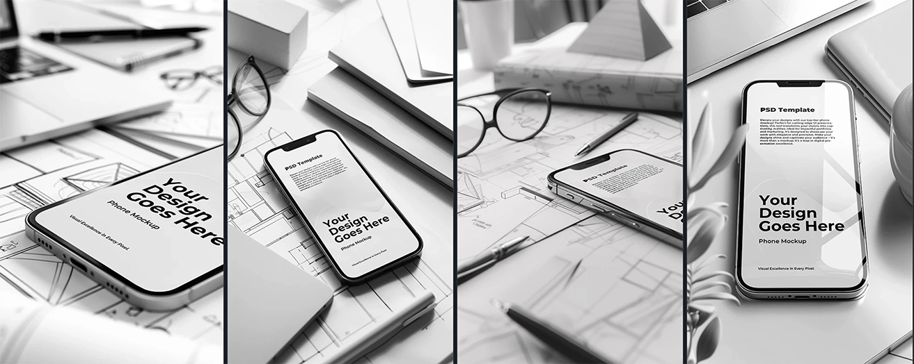
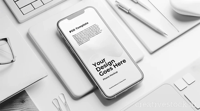
#1 - CreativeStock: White iPhone Mockup on Sleek Desk
This sits at the top because it does the job most designers actually need on Monday morning. A clean white iPhone arranged on a desk with keyboard, mouse, and mouse pad - not floating in nowhere, not faked up against a gradient. The composition gives a real workspace context, the lighting reads as photographic, and the screen area is where your design takes the lead.
The PSD comes at 5824×3264 pixels, 300 DPI, RGB color mode, and 198 MB of layer depth. Personal and commercial license included. For client decks where you need the design to feel like it already exists in someone's actual day-to-day setup, this is the default pick.
#2 - CreativeStock: Editable iPhone Mockup, White on Black
The white-on-black contrast is doing real work here. Black backgrounds make UI screens pop in a way that no gradient or texture can match - saturated colors get more saturated, white type reads cleaner, and the design sits forward instead of blending in. This is the mockup you reach for when the screen is the whole point and you don't want anything in the scene competing.
It's also the one that translates best across surfaces. Same file works for a portfolio cover, a case study hero, an Instagram carousel, an investor deck. One asset, four downstream uses, no styling drift between them.
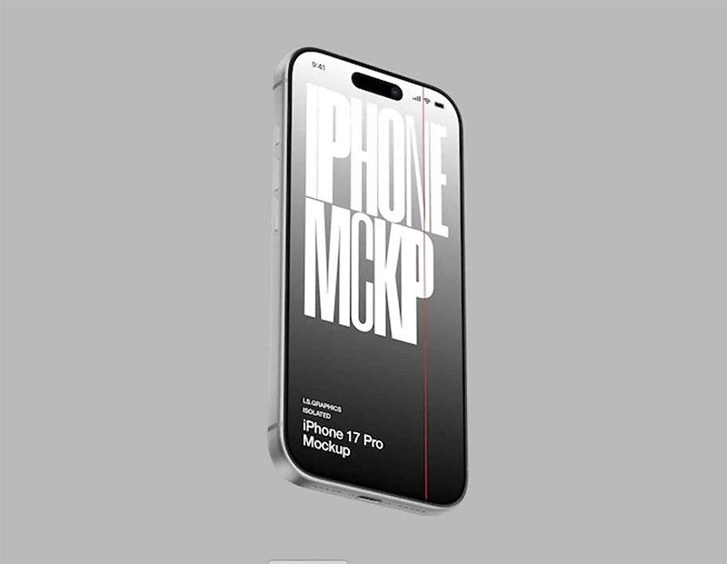
#3 - LS.Graphics: iPhone 16 Pro on Dark Textured Surface
LS.Graphics is one of the most respected mockup studios on the web, and their free tier is genuinely free, not a teaser. This particular mockup puts the iPhone 16 Pro on a dark textured surface with subtle shadow falloff and clean isolated lighting - a different vibe from the CreativeStock white-and-clean entries above, more dramatic, more editorial.
PSD, Figma, and Sketch formats included. Free download requires a quick account on their site. The dark texture forgives bold UI choices that would look cluttered on white, so this is the pick when your design leans saturated, gradient-heavy, or visually busy.
#4 - Unblast: Floating iPhone 17 Pro Mockup
Floating mockups got cliché for a reason - they work. The iPhone hangs in space with a real cast shadow underneath, the eye treats it as a hero element instead of a static prop, and there's room around it for other content without the composition collapsing. This Unblast version goes one better: 6000×4500 pixel resolution, three official iPhone 17 Pro colors (Silver, Deep Blue, Cosmic Orange), and PSD plus Sketch plus Figma in the same package.
It's the right pick for landing-page hero sections, App Store screenshots, and any spot where the design needs to read at a glance without competing context.
#5 - CreativeStock: Captivating iPhone Mockup with Pink Display
Color is doing argument-level work in this one. A pink display treatment turns a standard phone shot into a campaign visual - same device, completely different message. This is the mockup for designers working on consumer-facing brands, lifestyle apps, or anything where the pitch is feeling and not just function.
Don't use it for sterile B2B SaaS. Do use it when the deck needs to make someone feel something before they read the copy.
#6 - Good Mockups: iPhone 17 Pro PSD & Figma Set
Six PSD files in one zip - iPhone 17, iPhone 17 Pro, and a clay variant - plus a Figma version. Artwork resolution sits at 7000×4800 px, which is overkill for almost everything and exactly what you want when the file might end up on a billboard or trade-show banner two months from now.
Free for personal and commercial use, but the download requires a checkout-style step with a free code (currently "17set"). One-time friction, then the whole pack is yours. The clay variant in particular is worth keeping around - clay mockups are gold for early-stage branding pitches where you want to show the form factor without committing to specific UI.
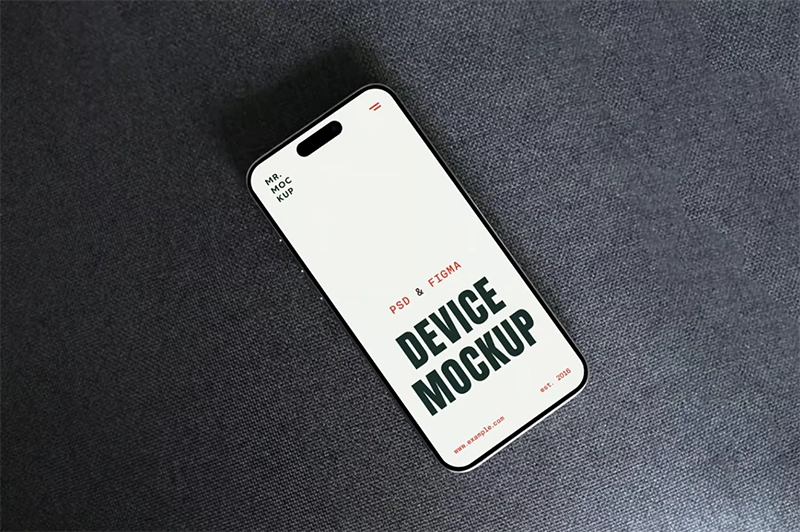
#7 - Mr.Mockup: iPhone 16 Pro on Sofa
This is the lifestyle pick. The phone rests on a sofa with natural fabric texture, soft ambient lighting, and the kind of casual composition that reads as a real photograph instead of a product shot. Mr.Mockup is one of the higher-polish freebie sources on the web, and this scene in particular is built for designers who need to put a screen in a context that feels lived-in.
Use it when the brand voice is approachable, the product is consumer, and the deck needs warmth instead of precision. Don't use it for enterprise software - the visual language won't match.
#8 - Mockups-Design: Multi-Angle iPhone 16
One PSD, multiple angles in the same scene. This solves a problem most lists ignore: a single deck rarely needs one mockup, it needs three or four showing the same UI from different perspectives - front for the headline screen, three-quarter for personality, isolated detail for a specific feature. Pulling those from different mockups creates lighting drift between slides. This file gives you a consistent set in one go.
Mockups-Design is one of the most-cited freebie sources in design lists, and the file is direct download - no signup, no email gate, no waiting. That alone is worth its weight when the deadline is in four hours.
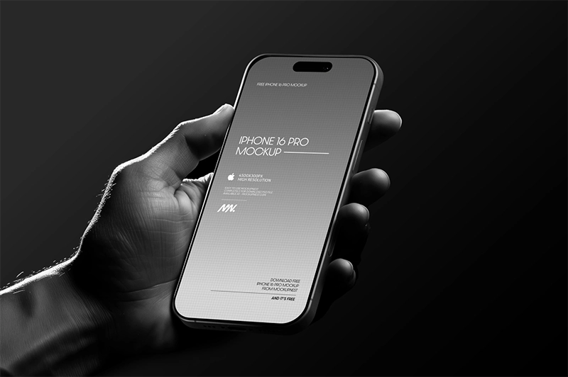
#9 - Mockupnest: Hand Holding iPhone 16 Pro
The hand-holding shot is the single most underrated mockup type for non-designer audiences. Clients don't read isolated renders - they read context. Showing the phone in a hand instantly converts the design from interface to product, and the brain does that translation faster than any explanation in the deck.
Mockupnest's version is photorealistic, 4500×3000 pixels, with smart object insertion and isolated shadows that let you drop in any background. It's free, the page is straightforward, and the hand grip looks natural rather than the stiff posed grip you see on most stock mockups. Reach for this one in client meetings, App Store videos, and any presentation where the audience isn't looking at pixels.
#10 - CreativeStock: Vibrant iPhone on Pink
Closing the list with the loudest pick on it. Vibrant iPhone on a saturated pink background - this is the visual energy you want at the end of a deck, on a campaign closer, on a launch announcement. It's not subtle, and that's the point. After nine well-behaved mockups, the deck needs a closer that lands.
Pair it with a clean opener (back to #1 or #2) and you have a presentation arc that actually goes somewhere instead of plateauing.
How to pick the right one for the job
The mockup is not a stylistic choice. It's a tool decision tied to who's in the room.
Internal design review needs the cleanest, most isolated render available. The team is reading craft, so let them see craft. Pick #2, #3, or #6 here.
Client approval meetings need context. A non-designer can't read an isolated wireframe - they need a visual that lets them feel the product. Pick #1, #7, or #9.
Landing page heroes and App Store screenshots need impact at a glance. Pick #4, #5, or #10.
Multi-asset projects - brand identity, campaign rollout, product launch - need consistency across many slides. Pick from the same source so the visual language doesn't break between assets. The four CreativeStock entries on this list (#1, #2, #5, #10) all share lighting logic, color treatment, and composition discipline, which makes them the safe stack for that kind of work. The full library lives in the CreativeStock mockups category if you need more variants.
Smashing Magazine has a long-running editorial thread on design and presentation craft for designers who want to read deeper into how environment shapes perception.
The dark question every designer avoids
Here's the one nobody wants to say out loud: does my work actually look bad, or am I just presenting it badly?
Almost always, it's the second one. Designers spend ninety percent of their hours on the work and ten percent on the framing - and then wonder why the framing is what kills the project. A great phone mockup doesn't fix bad design. But a bad phone mockup absolutely buries good design, and the designer never finds out which one happened, because the client just said "can we see another version?" and moved on.
Stop downloading whatever ranks first on Google. Start using mockups that match the audience in the room. The work will start landing.
Final word
Ten free mockups, ten different jobs. The point of this list is not to bookmark every link - it's to stop wasting hours hunting and start spending those hours on actual design and on the conversation with the client where the work either gets approved or doesn't.
That conversation is shorter, cleaner, and easier to win when the phone in your slide actually looks like the phone in their hand.
Start with the CreativeStock mockup library for the day-to-day approval workflow. Then come back to the guide on the best mockup sites for designers when you need the wider stack - packaging, apparel, print, and everything else that lives in the same deck as that phone scene.


