Let’s get one thing straight: “I just don’t like it” is not design feedback. It’s an emotional shrug wearing business casual. And if you don’t know how to respond to subjective design feedback, you’ll spend half your career redesigning perfectly good work because someone in the room had a mysterious feeling after two bad coffees and a LinkedIn scroll.
This is where junior designers usually start sweating and senior designers start asking better questions.
Because no, you do not need to turn every client conversation into a cage match.
And no, you do not need to sound like an arrogant design messiah who discovered kerning on a mountain.
You need a method. A boring, reliable, grown-up method.
Irritating, I know.
The real question is this: How do I beat “I just don’t like it” without fighting - and without sounding arrogant?
You stop arguing about taste and start leading the conversation back to goals, evidence, and tradeoffs.
That’s it. That’s the whole magic trick. The rest is delivery.
“I Don’t Like It” Usually Means Something Else
Clients, founders, marketers, and random stakeholders rarely say what they actually mean the first time. “I don’t like it” can mean:
- it feels off-brand
- it doesn’t look expensive enough
- it makes them nervous
- they don’t understand the choice
- they’re scared the boss won’t approve it
they had a different picture in their head and forgot to mention it like functioning adults
This is why designers get trapped. They hear a taste statement and respond with a taste defense. Then the whole thing collapses into nonsense.
If you want to defend design decisions without sounding defensive, stop treating vague reactions as final verdicts. Treat them as unfinished feedback.
A better response sounds like this:
“Got it. What specifically feels off to you here - the layout, the typography, the tone, or how it connects to the audience?”
Now you’re not arguing. You’re diagnosing.
And yes, this is also how to respond when a client says they “don’t like it” without sounding like you are one Slack message away from a breakdown. The same principle shows up in NN/g’s guidance on bad design suggestions, which is exactly why vague reactions should be translated before they drive decisions.
Taste Is Real. It’s Just Not the Decision Maker
Of course taste exists. We are not robots making tax forms in a basement.
But in professional design, taste does not get to drive the whole car.
It gets a seat.
Maybe a decent one.
It does not get the wheel, the budget, and custody of the deadline.
Strong designers know the difference between personal preference and decision criteria for design.
Before presenting work, establish what success means. Not “make it pop.” That phrase should come with a fine. I mean actual criteria:
- What action should the design drive?
- Who is it for?
- What needs to be understood in three seconds?
- What brand signal matters most here: trust, speed, clarity, premium feel?
What cannot be compromised?
That is how you create decision criteria for design before opinions start multiplying in the meeting room.
Once those criteria exist, feedback has somewhere useful to go. Without them, everyone is just decorating their anxiety.
If you need the bigger business version of that mindset, You’re Not “Irreplaceable” - You’re Just Cheap: How to Stop Being Disposable makes the same point from the angle too many designers learn too late: nobody pays extra for tasteful confusion.
The Calm Way to Push Back Without Sounding Like a Smug Little Goblin
A lot of designers think pushback has to sound dramatic. It does not. The best rebuttals are calm, specific, and mildly irritating in their logic.
Try this structure:
1. Acknowledge the reaction
“I hear you.”
2. Ask for the cause
“What feels off to you specifically?”
3. Re-anchor to the objective
“Our goal here was clarity for first-time visitors and stronger contrast on the offer.”
4. Show the tradeoff
“If we reduce hierarchy to make it feel softer, we may also lose scanability.”
That is presenting tradeoffs, and it is one of the fastest ways to improve stakeholder buy-in.
People calm down when they realize a design choice is connected to a consequence.
Suddenly the conversation becomes adult.
Disturbing, I know.
This is also how to defend design choices without sounding arrogant.
You are not saying, “I’m right because I’m the designer.”
You are saying, “Here is what this choice is doing, and here is what changes if we move it.”
That is persuasive. More importantly, it is useful.
NN/g’s work on stakeholder engagement backs this up nicely: alignment happens faster when people understand the decision frame, not when they are left alone with preference-based reactions.
Stop Presenting One Perfect Solution Like a Martyr
Classic junior mistake. I made it too. You polish one concept until your nervous system starts blinking, then present it like sacred text. Someone says, “Hmm, not sure,” and now you are emotionally negotiating for your life.
Do not do that.
Present options with intent.
Not twenty options. That is not strategy. That is panic with thumbnails.
Two or three is enough. Each should represent a clear decision path.
For example:
- Option A prioritizes clarity and conversion
- Option B feels more editorial and premium
- Option C pushes personality but sacrifices some immediacy
Now you are not begging for approval. You are guiding evaluation.
This is persuasive design communication. You are helping non-designers compare approaches using outcomes, not vibes. Which, frankly, is also how to explain design decisions to non-designers without making them feel stupid and without making yourself sound unbearable.
A presentation should not be “Here’s what I made.”
It should be “Here are the strategic choices, and here’s what each one buys us.”
Different game. Better results.
And if your presentation skills still look like you dragged the files into a deck and prayed, go read How to Present Design Work to Clients Without Begging. The title alone should tell you why it belongs here.

Turn Subjective Feedback Into Measurable Criteria
This is the part that saves your sanity.
When feedback is fuzzy, translate it into something testable.
“I want it to feel more premium.”
Okay. Premium how? More whitespace? Better typography? Less clutter? More restraint? Stronger photography? Darker palette? Slower pacing?
“I don’t like the headline.”
Fine. Because it is unclear, too aggressive, too generic, too long, or not aligned with the audience’s problem?
This is how to turn subjective feedback into measurable criteria. You keep pulling the thread until the opinion turns into a usable standard.
Then the room can make decisions based on something other than emotional weather.
And once you do this consistently, people start trusting your process. That trust is how you get stakeholders to approve a design decision without fake confidence or those weird over-rehearsed “creative leadership” speeches people do when they want to sound important.
Adobe’s guide on how to get design approval from clients is useful here too, especially on expectation-setting and making approval easier before the meeting turns into decorative chaos.
Make the Tradeoffs Visible, Not Mysterious
One reason subjective feedback gets out of hand is because too many designers present finished surfaces without showing the logic under them.
Stakeholders cannot evaluate invisible reasoning.
So they fall back on the only tool they have left: taste.
That part is on us.
If you want cleaner conversations, make the tradeoffs visible. Spell out what is being optimized and what is being sacrificed.
That can be as simple as:
- “This direction improves readability, but feels less expressive.”
- “This version feels more premium, but the CTA loses urgency.”
- “This layout gives the product more room, but slows down first-glance comprehension.”
That is how adults talk through design. Not by saying “this one slaps” and hoping procurement signs off.
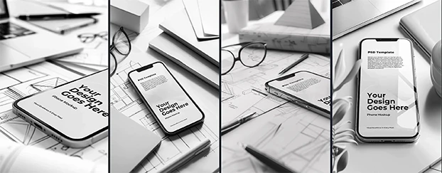
It also helps to show work in believable contexts. A strong set of mockup categories can make strategic differences more obvious because people stop reacting to floating rectangles and start reacting to actual use.
Strong Process Beats Strong Taste
Here is the ugly truth nobody tells juniors because too many people in this industry are still addicted to the fantasy of being misunderstood geniuses:
The job is not just making the thing. The job is making the thing understandable, defensible, and easy to approve.
That is why the designers who survive are not always the flashiest.
They are the ones who know how to frame decisions, reduce ambiguity, and stop meetings from turning into an opinion buffet.
You do not win by having better taste alone.
You win by making the criteria visible, the tradeoffs clear, and the next step easy.
That is how you stop being “the person who makes things look nice” and become the person people trust when decisions actually matter.
And yes, that usually means using better systems. Template libraries are useful here not because you cannot think for yourself, but because repeated communication problems do not deserve to be solved from zero every single week.
A Script You Can Use Immediately
Next time somebody says, “I just don’t like it,” try this:
“Totally fair. Let’s narrow down what’s not working for you. Is it the tone, the hierarchy, the color balance, or how it supports the goal? I want to separate personal preference from performance so we can improve the right thing.”
That line does several things at once:
- it stays calm
- it avoids ego
- it reframes the discussion
- it protects the work without sounding precious
- it moves the room toward actual decision-making
That is how to get stakeholders to approve a design decision more often: not by overpowering them, but by making the logic easy to follow.
You are not there to win a personality contest. You are there to lead the conversation somewhere useful.
Which, after twenty years in this industry, is about as close to peace as you are going to get.
FAQ
1. What should I say first when a client says, “I just don’t like it”?
Start by lowering the temperature, not defending the file. Say: “Got it. Can you tell me what specifically feels off - tone, layout, hierarchy, or brand fit?” Your first job is to identify the real issue hiding behind the reaction. Once the vague dislike becomes specific, you can solve it.
2. How do I defend my design without sounding arrogant or defensive?
Tie every explanation to objectives, audience, and tradeoffs. Do not say, “I chose this because it looks better.” Say, “I chose this because it improves scanability, strengthens message hierarchy, and supports the audience’s decision path.” That is the difference between ego and expertise. Calm logic wins more rooms than wounded genius ever will.
3. What should I change in my workflow so subjective feedback stops derailing projects?
Define success before presentation. Set criteria, show 2–3 intentional options, explain tradeoffs out loud, and ask stakeholders to react against goals instead of instinct. Do that a few times and the whole room gets smarter. Or at least less chaotic, which in design is basically the same thing.

Final Word
When someone says, “It’s just taste,” do not panic and do not perform. Taste matters, but goals matter more. Your job is to turn loose reactions into useful standards, then walk people through the consequences like the only adult left in the meeting.
That is how to respond to subjective design feedback like a professional.
Not louder. Not meaner. Just sharper.
And honestly, that is more devastating anyway.
If you are serious about cleaning up the way you present, defend, and package your work, at some point you also need to get serious about what you are selling and how you price it. Start there: CreativeStock Pricing.