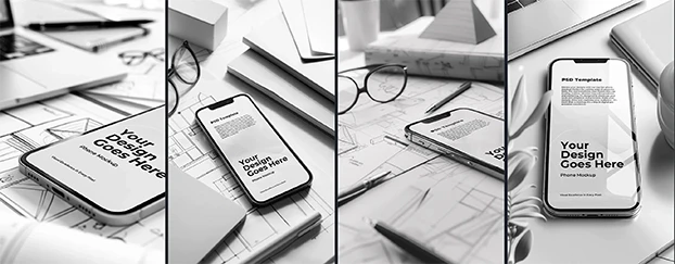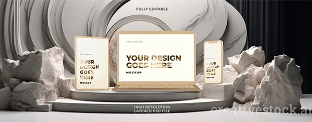
Let’s be honest: flat UI comps are the intern’s handshake - polite, limp, easily ignored. The market’s attention span is measured in thumb swipes, and you’re still showing wireframes taped to a mood board? Cute. If you want clients to stop squinting and start approving, 3D mockups are the only language they actually hear. Depth, parallax, texture, physical context - suddenly your interface stops pretending it’s a concept and starts behaving like a product.
I’ve spent two decades arguing about 4-point padding and color contrast while stakeholders asked, “But what will it look like… for real?” Newsflash: this is the New Visual Realism era. We don’t sell ideas; we sell believable outcomes. And nothing sells faster than 3D realistic visuals that look photographed, lit, and lived-in.
Why flat UI dies in stakeholder meetings
Flat UI is great for us - fast to iterate, clean for devs, tidy in Figma. But for decision-makers, it’s ambiguous. They can’t feel material, scale, or depth. A homepage floating on a gray artboard might as well be a vaporwave poster. Add 3D presentation assets - a laptop on a desk with imperfect reflections, a phone with micro-bevel highlights - and suddenly your design inherits credibility from the “real” world. It’s the same pixels, different physics.
Here’s the uncomfortable truth: clients don’t buy the design; they buy the consequences of the design. 3D mockup visual realism gives them a consequence to latch onto: “This widget will live here; this button will be clickable there; this packaging will sit on that shelf under those fluorescents.” When you control the scene, you control the narrative. And you stop bleeding hours explaining obvious things.
Depth is not decoration - it’s proof
You can throw gradients at a layout all day and call it “depth.” Nobody cares. What sells is high-depth mockups: occlusion, scale, focal blur, and honest shadows that behave like light, not like filters. The human eye is trained, since childhood, to trust scenes that obey physics. If your “realistic UI mockups” break those rules, viewers won’t rationalize why; they’ll just feel it’s off and keep scrolling.
Three components I never compromise on:
- Shadow discipline. Hard key light, soft fill, or ambient-only - pick a lighting model and commit. Sloppy shadow directions scream “fake.”
- Material honesty. Glass, metal, brushed plastic - each reflects differently. Don’t slap the same specular highlight on everything and call it a day.
- Scale sanity. If the phone looks like a paperback in one frame and a domino in the next, your credibility just left the building.
Want your frames to feel like they were lifted from a film? Study cinematic mockups and borrow their lighting discipline.
The UI → Reality gap (and how 3D closes it)
UI lives in a controlled vacuum. Reality is noisy. The job of 3D product visualization is to bridge that gap without lying. You’re not polishing a turd; you’re showing the product in contexts it will actually face: glare on a kiosk in a mall, greasy fingers on a food app, a shipping box under warehouse lighting. If you win under realistic conditions, you’re not just “selling” the design - you’re de-risking the launch.
That’s why modern teams treat 3D as part of design ops, not a last-minute gloss. Platforms that provide ready-to-use, professionally-finished mockups shorten the road from concept to believable artifact; you get a library of scenes, devices, packaging, and surfaces tuned for quick customization and consistent quality, so you spend time deciding, not fabricating.
When do 3D mockups matter most?
Short answer: earlier than you think. Long answer: any time a decision hinges on “will this feel real?”
- Brand launches: Show the system alive - merch, signage, packaging - before the first invoice goes out.
- E-commerce: Product cards in contextual lighting boost perceived quality and reduce returns.
- App pitches: Put flows on believable devices with hand presence and depth. Suddenly investors stop asking “what if” and start asking “how soon.”
- Retail & OOH: Simulate viewing distance, glare, and scale; your typography sins won’t survive, which is good.
There’s solid marketing evidence that product evaluation and purchase intent improve in realistic 3D environments - see this peer-reviewed study in the Journal of Interactive Marketing.
“But won’t 3D make everything look too perfect?”
Only if you chicken out and aim for catalog gloss. The trick is calibrated imperfection: fingerprints on glass at 3–5% opacity, slightly uneven desk grain, a scuffed corner on the box. Small realism cues raise trust more than ultra-sterile renders. Add them with restraint. You’re crafting evidence, not perfume.
A minimal recipe for realistic 3D mockup techniques
- Pick one hero light. Let it do 80% of the job. Avoid the “studio light salad.”
- Respect the camera. 50mm equivalent keeps proportions believable. Save wide angles for environmental shots.
- Color in context. Don’t pick brand colors in a vacuum; sample them in the scene. Warm wood will “eat” some blues; cool metal will kill warmth.
- Micro-physics. Tiny softness on shadows, subtle depth of field, believable reflection falloff.
- Consistency pack. Establish a scene preset for a campaign and reuse. Consistency beats novelty in brand systems.
If you want the hard science behind shadows and depth perception, start with shadow stereopsis.
“Best 3D mockups for designers” (without naming brands)
I’m not here to sugar-coat: pick libraries that are curated, not dumpster fires of random uploads. Look for:
- Device completeness: multiple angles, current-gen sizes, accurate bezels (no “2019 phones” in 2026 decks).
- Packaging range: cartons, bottles, flexible pouches, and label curvature that doesn’t warp your design into a crime scene.
- Lighting families: scenes that share light temperature and intensity so your campaign doesn’t look like it traveled through five planets.
- Editable layers: masks, smart objects, and surface normals that let your design interact with the scene (wrap, warp, reflect).
- Real-world categories: devices, print, apparel, packaging - so one ecosystem can cover the whole pitch to production journey.
Using 3D mockups for UI design (my ruthless checklist)
- Design first, mockup second. If you’re using 3D to rescue weak UI, I can’t help you.
- Choose the moment. Don’t mock the entire flow - pick the “aha” screen and one friction point.
- Set the environment. Desk, pocket, kitchen counter, checkout line. Context dictates lighting and scale.
- Proof of interaction. Add finger proximity, slight smudges, or a soft reflection of the user - subtle human presence sells usability.
- Ship as a story. One hero, one detail, one comparison (before/after or 2D/3D). That’s your slide deck.
The politics of persuasion (a.k.a. why stakeholders fold)
People don’t argue with what looks photographed. It’s emotional math: why 3D mockups look real is less about polygon count and more about the psychology of visual realism. When your visuals honor how light, distance, and materials behave, viewers’ cognitive load drops. They stop deciphering and start deciding.
And yes - speed again. Pre-built, high-quality assets remove the friction between iteration and persuasion, letting individual designers, small teams, and non-experts deploy credible visuals fast. That accessibility is the point: professional-quality results without building everything from scratch, so the team can focus on decisions, not assembly.
“High-depth” isn’t hype - it’s a business case
- Trust: Real-looking visuals reduce the demo gap.
- Clarity: Stakeholders see hierarchy, scale, and contrast as they’ll appear in use.
- Velocity: Faster approvals mean fewer zombie rounds of “one more tweak.”
- Consistency: Systems built on reusable 3D presentation assets retain a coherent look across touchpoints.
You can keep shipping flat comps and hope everyone imagines the same future - or you can show it, with 3D mockups that behave like reality and kill the debate before it starts.
Quick Start: From UI to 3D in 30 minutes
- Export your hero UI screen at 2×.
- Pick one realistic UI mockup scene that matches your use case (desk, hand, retail shelf).
- Drop your screen via smart object; match device bezels and corner radius - no cheating.
- Nudge white balance and exposure to sit naturally in the scene.
- Add one human cue (finger, reflection, accessory) at whisper-level.
- Render two crops: full context and 1:1 detail. Present as a pair. For wall art and print presentations, an interior frame mockup gives instant environmental realism without modeling a set.
FAQ
1) What’s the fastest way to choose the right scene without wasting hours?
Start from the use environment first, not the device. If the product is used in bright retail, pick a scene with harder key light and slight glare; for productivity apps, go for neutral desk lighting. Keep a personal shortlist of 6–8 go-to scenes (2 devices, 2 packaging, 2 print, 2 environmental) and reuse them as a campaign “lighting family.” Consistency beats novelty and makes your brand look like it had a grown-up in the room.
2) How do I keep 3D from looking fake or “too glossy”?
Reduce perfection by 10%. Lower specular intensity, add micro-noise to materials, soften shadows a hair, and introduce one natural flaw (tiny fingerprint, scuff, fabric crease). Calibrate blur - overdone bokeh screams “Instagram filter,” not realism. If you’re unsure, print a frame and check it under real light; your eye will catch lies on paper that screens forgive.
3) Where do 3D assets fit into my workflow without blowing up timelines?
Treat them like design utilities, not art projects. Use curated libraries of finished mockups and templates that are built for quick customization, so you’re composing, not modeling. Keep them in your shared team library; pair them with templates for print, apparel, packaging, and devices so the same system covers concept through launch, minimizing tool-switching and accelerating approvals.
Final word
If you’re still defending flat comps in 2026, enjoy your museum. The rest of us will be busy shipping work that looks - and therefore is - real.

