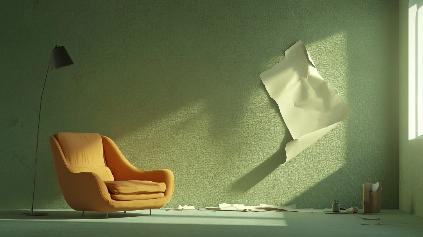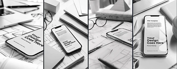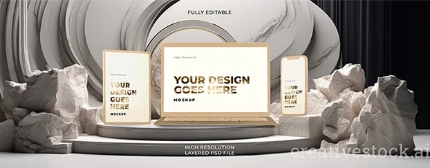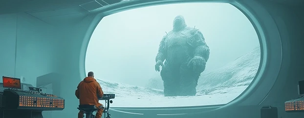
If you’re still shipping flat presentations in 2026, congratulations - you’ve chosen to make your work look like a wireframe dressed for a funeral. The rest of us are moving to cinematic mockups: design previews with depth, light, and emotion that actually sell. I’ve been doing this for two decades. I’ve seen clients yawn through lifeless boards and then lean forward the moment a frame feels like a still from a product film. This article is the next step: not just “make it real,” but “make it cinematic” - with depth cues, lens behavior, and editorial lighting that guide attention and emotion. If you need the baseline on realism, start with the standard we all answer to now: Photoreal Mockups.
This isn’t artsy fluff. It’s outcomes: attention, comprehension, conversion. Today’s tools make it doable at speed - AI-generated assets refined by people who know what a specular highlight is for. You get polish without a 10-hour lighting pass, and you stop apologizing for flat PNGs that never had a chance. If you’re sourcing, don’t wander - go straight to curated libraries of mockups that are production-ready.
Why Flat Mockups Fail in 2026
Flat visuals were a mercy - fast and “fine.” Now they just look like you didn’t care. Audiences scroll at trailer speed; a thumbnail has milliseconds to read as real and desirable. Flat surfaces don’t tell me material, scale, or context. They don’t answer even one marketing question: How big is it? What’s the finish? Where does it live? Why should I care?
Cinematic mockups fix that with focus, atmosphere, and story. They’re not dramatic for drama’s sake; they’re informative. A bottle with crisp highlights says “glass and weight.” Soft falloff over a textured table says “premium lifestyle.” A shallow depth of field whispers “this is the hero - eyes here.” You can dismiss that as “extra,” or you can watch it outperform your flat boards in every stakeholder review.
And no, cinematic ≠ slow. Start from high-quality, ready-to-use templates and cinematic design assets that already encode proper materials and lighting controls. When you need believable surfaces fast, brush up on material truth with this deep dive on realistic mockup textures.
3D Cinematic Mockups: Make Depth Do the Selling
You don’t need a VFX pipeline to let depth pull its weight. 3D cinematic mockups let you nudge the camera ten degrees and suddenly the product speaks: bevels, chamfers, label curvature - all selling before your copy shows up.
Practical playbook:
Three-plane thinking (foreground, subject, background): create real parallax and hierarchy so the eye lands where it should.
Specular management: crisp highlights for glass/metal, broader rolls for matte plastics; let reflections describe form.
Micro-shadowing: tiny occlusion along seams and lids communicates build quality, even for civilians who can’t name why it feels “right.”
Buy or build assets that behave like real objects: clean normals, believable surface response, and sensible scale. If the base is wrong, you’re polishing a balloon animal. For fast category wins, grab print-ready scenes from print materials mockups and adapt them to your brand.
Depth-of-Field Mockups: Direct Attention Like a Cinematographer
Depth-of-field mockups aren’t “pretty blur.” They’re attention funnels.
Use DOF to:
Gate noise: blur busy textures so the label and claim own the sharp plane.
Mark the money zone: focus where the decision lives - logo, flavor name, CTA badge.
Signal tier: shallow DOF reads premium because it implies larger sensor/pro glass - an unconscious quality cue.
Common rookie sins: focusing behind the product (yes, I’ve seen it), bokeh smearing over type, and smashing aperture so hard the object turns into a soap bubble. Start subtle. Then commit where it helps the story. Want a quick refresher that translates directly to mockups? Study Cambridge in Colour’s classic primer on depth of field.
Dramatic Lighting Mockups: Light the Brand, Not Your Ego
Dramatic lighting mockups are where seniors and juniors part ways. If your rim light is louder than the packaging, you lit your ego, not the product.
Anchor your scene with:
Key for readability: 70–80% of the brand panel must be cleanly legible.
Fill for believability: bounce from plausible surfaces to kill the videogame look.
Accent for separation: a controlled edge light to lift silhouette - no neon frenzy.
Map lighting to strategy: soft top-light for wellness, angled warm key for craft food, cooler edge for tech minimalism. Need a crisp, visual explanation you can hand to a teammate? This Adobe guide on low-key vs. high-key lighting nails the mood and contrast controls you’ll reuse in mockups, not just motion.
The Toolkit: Hyper-Realistic Mockups, Minus the Photoshoot
I love a real set day - the coffee, the gaffer grumbling about C-stands. But not every brand has budget or time. Modern hyper-realistic mockups and cinematic mockups for designers give you agency: swap labels, adjust finishes, localize SKUs, validate packaging before production. That’s leadership, not compromise.
Start with high-resolution mockups and ready-to-use templates as base layers; spend your time on narrative and nuance. The blend - AI speed with human taste - is the throughput/quality sweet spot for 2026. If procurement wants to “try before buying,” point them to a curated set of free mockups and then scale to the full library when approvals land.
Techniques That Actually Move the Needle (Save the “Vibes” Talk)
Here’s the unglamorous checklist I hand juniors (after I finish sighing):
1) Cinematic depth mockup techniques
Edge-aware sharpening only on the focal plane.
Local contrast on emboss/deboss; keep it out of deep shadows or you’ll plasticize the scene.
Sub-pixel chromatic aberration to mimic lens behavior - tiny, not TikTok.
2) 3D cinematic visual style
Lens at ~50–65mm equivalent for honest proportions; go wider only when the environment is the hero.
Grounded shadow with believable softness (think: “size” of sun/softbox), not a sticker-shadow halo.
Backgrounds with story texture (plaster, woodgrain, anodized aluminum) at realistic scale.
3) Cinematic product presentation
Sequence frames like a mini trailer: hero → context → detail → claim.
Warm key for food/drink, cooler key for electronics, neutral/clean for pharma/clinical.
Brand color present but not flooding everything - if everything shouts, nothing speaks.
Also, label your work honestly. People are searching for 3D cinematic mockups, depth-of-field mockups, dramatic lighting mockups, and cinematic design assets. If you hide what it is, you hide from your buyers.
How Cinematic Mockups Fit Your 2026 Roadmap
You’ve nailed realism. Now orchestrate cinema. Use lens behavior, depth, and lighting to turn accurate objects into persuasive scenes. From here, branch into category-specific executions - apparel with fabric truth, packaging with surface-accurate reflections, devices that don’t look like plastic render toys. Replace just one flat slide in your next deck with a 3D cinematic mockup using a controlled rim, shallow DOF, and honest materials. Watch the conversation shift from “make the logo bigger” to “when can we launch?”
FAQ - No More Excuses
1) “What’s the fastest way to turn my flat board into a cinematic mockup today?”
Start with a layered mockup that includes lighting/reflection passes. Drop your design, set lens to ~50–65mm, add a realistic ground shadow, and introduce subtle DOF (focus on the decision area - logo/claim). Finish with micro-contrast on key textures and a restrained rim to separate from background. Time-box it to 30–45 minutes.
2) “How do I keep cinematic looks from killing legibility?”
Legibility governs style. Keep most of the brand panel in clean key light. DOF should enhance hierarchy, not swallow it - blur only what you want ignored. If type fails at thumbnail size, reduce blur, raise fill, and tame reflections. Cinematic ≠ moody mush. Cinematic = controlled attention.
3) “What does good look like for stakeholders who ‘don’t get it’?”
Sequence, don’t just drop a hero. Show hero → context → detail → claim on one page. In the hero, the product reads in one second. In context, it’s grounded. In detail, materials scream “quality.” In the claim frame, the promise is crystal clear. That four-beat rhythm accelerates approvals.
Final Word from the Grump in the Back
Flat mockups weren’t evil. They were a phase. But they don’t win 2026. Cinematic mockups do, because they respect how humans actually see: with depth, with light, with context. If that sounds “extra,” good. Extra is what stands out in a feed packed with everything. Use 3D cinematic mockups, depth-of-field mockups, and dramatic lighting mockups not as decoration, but as arguments your client can feel.
Now, go rebuild your presentation system. Start with one product. Give it a scene. Direct the frame. Make it cinematic - and make it convert. When the team’s ready to scale beyond dabbling, compare the pilot set to the full library and move up at pricing.

