
You want photoreal. You keep shipping “good enough.” Clients clock the difference before the page even finishes loading. Consider this a lovingly grumpy memo from a senior who’s watched one too many decks derailed by crunchy paper grain and UFO shadows. We’re talking realistic mockup textures, realistic shadows, and physical geometry in mockups - the holy trinity. Break these rules and your work screams “fake” no matter how clever the concept. If you somehow missed the memo, start with Photoreal Mockups: the 2026 standard.
Rule #1: Texture Scale Isn’t a Vibe - It’s Physics
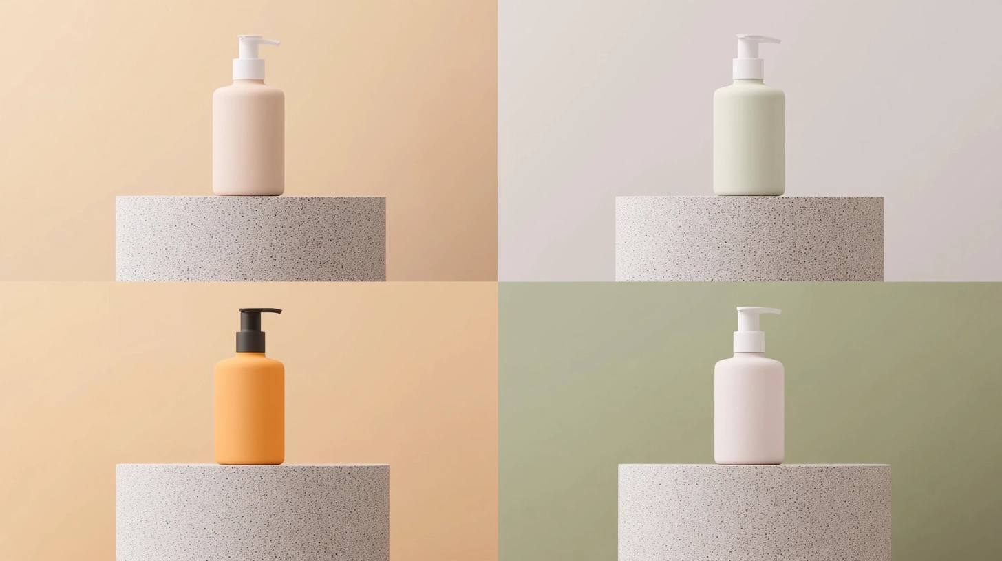
If your A4 sheet looks like it was printed on a sidewalk, we have a texture crisis. Texture frequency must match scale. On uncoated paper, fiber is subtle, not a loud snowstorm. On T-shirts, the knit isn’t a checkerboard; it’s a fine weave that barely disrupts the ink. That’s surface texture accuracy, not “noise sprinkled on top.”
How to improve mockup textures (do this today):
- Soften or downscale high-frequency patterns until they sit behind the ink layer.
- Add a whisper of micro-relief at edges so the highlight breaks naturally - this sells mockup material realism better than any filter.
- Keep gloss honest. Glossy ≠ plastic. Matte ≠ lifeless gray. Real surfaces have micro-variation and non-uniform roughness.
When you need to sense fabric scale quickly, study real garments and test against high-quality apparel mockups. For theory that explains why scale and filtering matter, read CMU’s classic survey of texture mapping.
Rule #2: Shadows Start at Contact - Not in the Blur Menu
The blur tool is not a lighting degree. Realistic shadows begin with contact: the tight, darker band where the object meets the surface. Then - and only then - comes the penumbra: softer, lighter, directional falloff.
Shadow and texture alignment in mockups:
- Paint a crisp 1–3 px occlusion where label meets bottle, sticker meets laptop, card meets table.
- Extend a soft, lower-opacity tail away from the key light.
- Let the shadow inherit the substrate’s grain. Slight modulation = instant realism.
- No floating. If your sticker looks levitated, your contact band is too weak or missing.
If lighting logic keeps tripping you up, here’s a concise primer: Adobe’s guide to shadow catchers. For applied lighting decisions and common pitfalls in scenes, dig into this breakdown on mockup lighting.
Rule #3: Geometry Is the Illusion - Respect It or Wreck It
A label staying perfectly rectangular on a curved jar? Magic trick - bad one. Realistic geometry for mockups means perspective, curvature, and parallax all agree.
Quick geometry checklist (pin this):
- Curvature: Warp the artwork to the container’s profile. Verticals compress toward tangents; horizontals arc.
- Perspective: Front planes foreshorten less than top planes. If your cap ellipse equals your label ellipse, something’s off.
- Parallax: Graphics drift more at the edges than in the center when mapped on curves.
- Edge lift: A hairline highlight along sticker edges, with a faint perimeter shadow.
- Depth of field: Let the world breathe. Hyper-sharp everything screams composite.
Rule #4: Material = Behavior (Not Just Color)
Your matte carton shouldn’t shine like chrome. Your aluminum can shouldn’t diffuse light like felt. Material realism is about how light behaves, not hex codes.
Texture realism techniques:
- Paper: Broad, low-contrast highlight; shadows that die quickly.
- Varnish spot: Localized, sharper specular that rides the print, not the substrate.
- Fabric: Slight ink sink and micro-break on ribs; edges are never razor-perfect.
- Metal: Directional specular streaks; labels and bare metal reflect differently.
Short on time? Grab a couple free mockups to test material behavior head-to-head instead of repainting physics by hand.
Rule #5: Alignment - Grain, Shadow, Lens Language
You dropped a poster onto a brick wall, but the brick’s diagonal and the poster’s perspective are dead straight. Reality just left the chat.
Fixing texture mistakes in mockups:
- Match substrate angle. Rotate/warp your poster so grain and perspective rhyme.
- Add micro-occlusion where edges meet the wall. Five to fifteen percent multiply goes a long way.
- Mind the lens. Wide-angle scenes exaggerate edges; telephoto compresses. If the base looks 24mm, let your overlay inherit a touch of curvature on the edges.
Need a reality check? Compare your overlay against an interior frame mockup on a brick wall and watch how grain, shadow, and lens language agree.
Rule #6: Consistency Beats Cleverness (Every. Single. Time.)
The “clever” part is irrelevant if half your scene whispers “softbox” and the other half screams “overcast at 4 p.m.” Pick a lighting story and honor it: one key direction, believable fill, unified color temperature, and shared contrast. That’s how work stops feeling AI-ish and starts feeling photographed.
Build a mini system - device, packaging, print - under the same look, then scale variations from there. A consistent family of mockup assets makes that painless.
Rule #7: The Sanity Pass (Ship Like a Senior)
Here’s the workflow I shove at juniors who keep fighting the uncanny valley:
- Choose a base that already matches the brand’s light/lens/surface. If you start with chaos, you’ll ship chaos.
- Map the art with real curvature and perspective; compensate for spines, seams, and bevels.
- Contact reality: Paint contact shadows and micro edge-lifts. Two minutes, massive payoff.
- Material behavior: Subtle dodge/burn on a neutral gray layer to nudge specular and roughness.
- Texture pass: Grain belongs under ink; add gentle micro-noise only inside shadows to avoid “plastic smoothness.”
- Global check: White balance, key-light direction, shadow softness all consistent.
- A/B quickly: Two crops or two shadow densities. Keep the one that survives as a 320-px thumbnail.
This is the shortcut. The other shortcut is denial. Pick one.
Bonus: What Clients Actually Notice (Even If They Can’t Name It)
- Edge honesty: Fabric prints have micro-breaks along ribs. If your T-shirt graphic looks vinyl-perfect, it reads as fake.
- Shared light: Every element agrees on where “north” is. Mismatch = amateur hour.
- Clean perspective: No perfectly parallel lines on curved products. Ever.
- Believable grading: Premium whites are clean, not chalky; blacks retain detail. If your grade muddies everything, nothing feels premium.
This is the New Visual Realism: “realistic or nothing.” Meet the bar or be ignored.

FAQ - The “Okay, But How?” Section
Q1: What’s the fastest way to fix obviously fake textures without rebuilding everything?
Start with scale. Shrink high-frequency noise until it recedes behind the ink. Add subtle edge relief so highlights break naturally. Then correct roughness behavior - tiny specular on varnish, broader softer one on matte paper. This three-step patch handles most “how to improve mockup textures” issues in minutes.
Q2: My shadows look mushy or floaty. How do I make them realistic, fast?
Build them in two layers: a thin contact band (crisp, darker) right at the touchpoint, and a separate soft falloff that follows light direction. Lower opacity with distance; let both layers lightly inherit the substrate grain. That nails most “shadow and texture alignment mockups” complaints without re-lighting the scene.
Q3: Labels on curved objects keep looking warped in the wrong places. What am I missing?
You’re ignoring parallax and tangents. Compress verticals toward the sides, arc horizontals, and expect graphics near edges to drift more than the center. Add a faint edge-lift highlight and a shy shadow under the label’s perimeter to avoid the “sticker glued to glass” effect.
Final word (and yes, a nudge)
Respect texture scale, honor contact shadows, and make geometry your religion. That’s how realistic mockup textures stop being a buzzword and start being the reason your work looks like it actually exists. Ready to move past “good enough”? See pricing and ship work that survives both zoom and thumbnail.


