
I’ve watched more “perfect” layouts die in production than I care to admit.
They looked incredible in mockups. Balanced. Minimal. Thoughtful.
Then they hit real materials.
And reality doesn’t negotiate.
If you’ve been living inside PSD previews and glossy renders, let me save you some embarrassment: mockups are marketing. Production is physics.
And if you’re serious about designing for packaging production, you need to start designing for distortion, tolerance, texture, glare, stretch, ink spread, and human error - not for curated lighting and polite alignment guides.
Let’s talk about where layouts actually break, and how to build work that doesn’t.
Production Tolerances: The 1–2 mm That Ruins Everything
Every production method includes production tolerances. That means shifts. Registration drift. Die-line creep. Plate stretch. Nothing lands exactly where you placed it.
This isn’t “bad printing.” It’s normal variability - the entire reason ISO 12647 process control standards exist.
Translation: your layout will move.
If your logo sits 1 mm from a fold, seam, or trim edge, you didn’t design a layout. You designed a liability.
And this is where most designers quietly panic:
How do I design for real materials when I’ve only ever ‘tested’ my work in mockups - and I’m terrified it will fall apart in production?
You design assuming it will shift.
- Increase safe zones beyond printer minimums.
- Keep critical elements away from structural tension points.
- Assume slight misalignment and test for it.
- Protect hierarchy from drift.
A professional layout survives minor imperfection.
A fragile layout collapses under it.
If you want the practical “don’t-send-garbage-to-press” version of this, use the print-ready PDF checklist before you export anything.
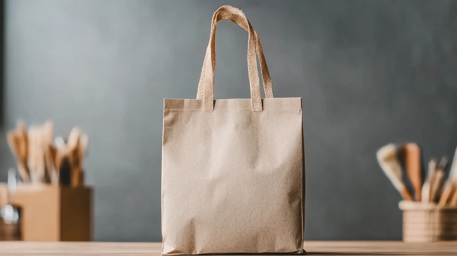
Packaging: Where “Clean” Turns Into Unreadable
Packaging is the fastest way to expose inexperience.
Packaging printing constraints are not optional
Let’s talk about packaging printing constraints honestly.
Ink spreads.
Uncoated stock absorbs.
Metallic films alter color perception.
White ink behaves differently.
Color behavior alone is governed by profiling systems - which is why the International Color Consortium (ICC) profile standard exists in the first place.
I once reviewed a craft label set in 6 pt legal copy on textured stock. Looked elegant in the mockup. Printed as a gray smudge. Reprint. Delay. Awkward phone call. Exactly the kind of “tiny” decision that becomes expensive.
If you want to avoid the classic packaging design mistakes that ruin readability, do this:
- Increase microcopy size beyond “minimum.”
- Add tracking to small type.
- Strengthen contrast assuming it will drop in print.
- Avoid relying on subtle color differences.
Your job isn’t to make it look refined on screen.
Your job is to make it readable in a store under hostile lighting.
If you’re still judging packaging layouts primarily through glossy previews, at least start with realistic assets from packaging mockups so you’re not designing in a fantasy vacuum.
Fabric: Physics Doesn’t Care About Your Grid
If packaging is structural distortion, fabric is physical distortion.
Designers ask what changes when designing for fabric printing?
Everything.
Fabric print limitations simplify your work for you
Fabric print limitations are brutal:
- Fine lines soften.
- Small type turns into texture.
- Tight patterns warp under tension.
- Dark garments swallow contrast.
If your design depends on surgical precision, it won’t survive contact with cotton.
So you adjust:
- Thicken strokes.
- Increase minimum text size.
- Simplify icon detail.
- Avoid micro-patterns unless tested at scale.
And yes - you can’t “mockup” your way out of fiber scatter and stretch. But you can stop lying to yourself with clean renders. Use apparel mockups for presentation - not validation.
Want a single example of a clean-looking scene that still won’t save a fragile design? This T-shirt mockup in a white elegant bed setting is exactly that: great for selling, useless for testing.
Signage: Distance Is a Brutal Editor
Signage fails because designers underestimate environment.
Real-world signage competes with motion, glare, distraction, uneven lighting, and human impatience.
Basic signage readability rules aren’t aesthetic suggestions - they’re survival mechanics. If you want a research-backed reminder of scanning behavior and readability under cognitive load, read Nielsen Norman Group’s guidance on how people read and scan content and apply the same ruthless clarity to signage.
Here’s what it means in practice:
- One dominant message.
- One supporting line at most.
- High contrast.
- Generous spacing.
- Type sized for distance, not portfolio beauty.
Most signage designs that fail in real environments and why fail because designers confuse subtlety with sophistication.
Stand ten meters away from your layout.
If it doesn’t communicate instantly, redesign it.
How to Design Layouts That Survive Real Materials
You want it distilled into something usable? Fine.
1) Protect what matters
Brand name. Product name. Mandatory info.
These get the biggest safety buffers.
That’s how to account for production tolerances in design without overbuilding everything - prioritize what must survive.
2) Stress-test before sending
For packaging:
- Shift elements slightly.
- Reduce contrast artificially.
- Print at 100% scale.
For fabric:
- Zoom out.
- Blur slightly.
- Simplify until hierarchy holds.
For signage:
- View at small scale to simulate distance.
- Test in grayscale for contrast strength.
If your design only works under perfect conditions, it isn’t production-ready.
If you want the bigger picture of real-world failures designers keep repeating (and how to stop being one of them), read the design production checklist before your next job goes live.
FAQ
1) Why did my packaging look perfect in mockup but fail in print?
Because mockups simulate lighting and placement - not ink spread, substrate absorption, finish glare, or registration drift. Increase safe zones, strengthen contrast, enlarge microcopy, and test at actual size. Assume imperfection from the start.
2) What changes when designing for fabric printing compared to packaging?
Fabric introduces softness, distortion, and texture interference. Thicken strokes. Simplify detail. Avoid micro-typography. Test hierarchy under slight blur. If it doesn’t read clearly with distortion, it won’t survive production.
3) How do I know if my layout is resilient enough for real-world signage?
Test for speed and distance. Reduce it in size on screen to simulate range. Remove color to test hierarchy. If it requires effort to interpret, simplify. Signage must communicate instantly, not politely.

Final Word
If your work collapses after shipping, the problem usually isn’t the printer. It’s discipline.
Production-aware designers charge more because they prevent expensive failure. That’s not ego. That’s risk control.
And if you’re serious about being paid like someone who understands reality - not just someone who makes things look good - then stop designing for screens and start designing for materials.
When you’re ready to operate at that level, set your pricing like a production-aware professional.


