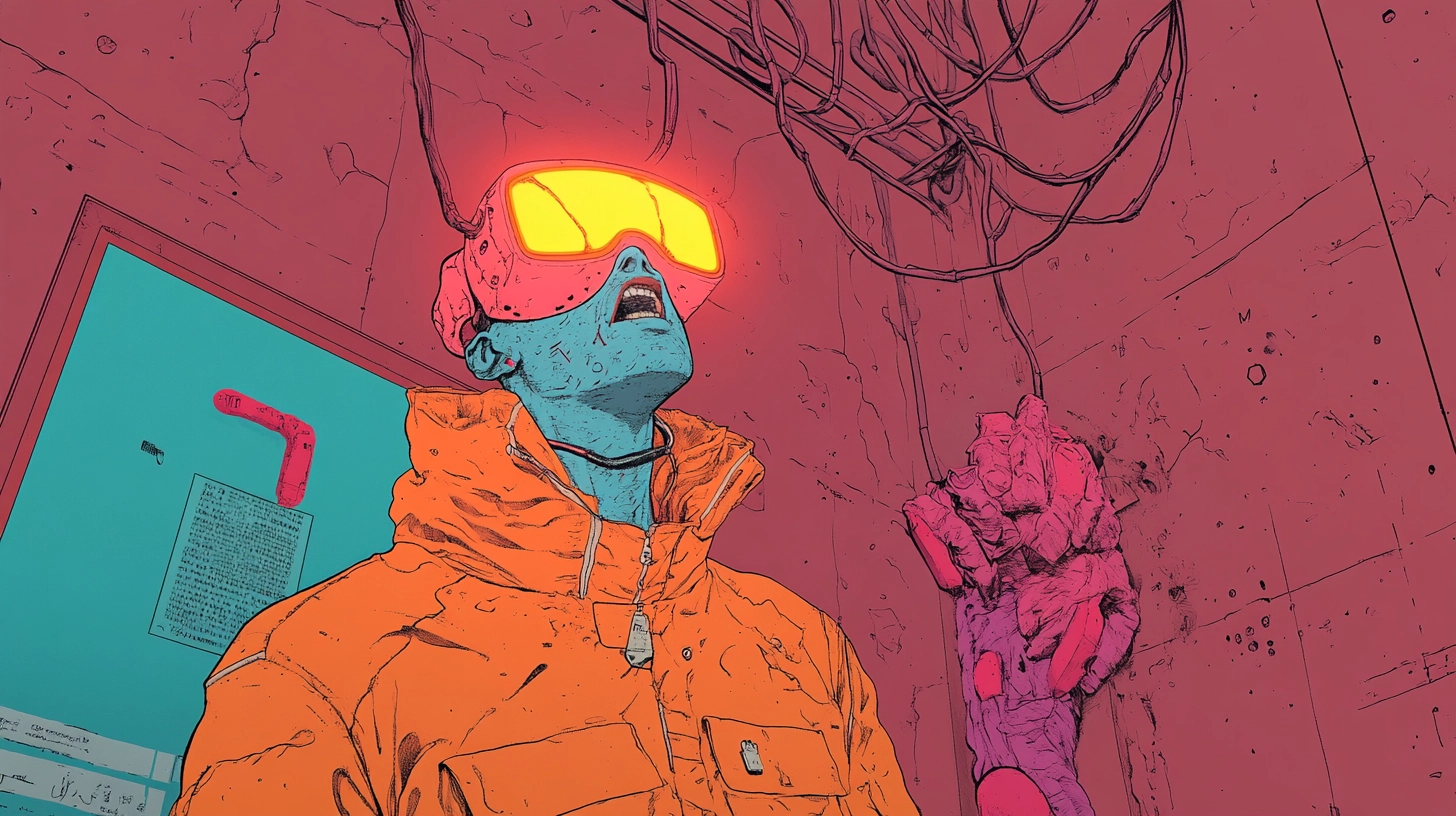
You want the truth? Pixels lie. So do slick mockups, retina displays, and that Behance case study you zoomed in on for courage. Real life eats “perfect” for breakfast. If you’ve ever watched a gorgeous layout die on press or a packaging concept collapse the second it meets a folding machine, welcome to the club I didn’t want to join.
The antidote is boring, unsexy, and mandatory: a design production checklist. Without it, your “final-final” is just a lottery ticket you bought with your reputation.
Below is the blunt, field-tested version I run before anything leaves my desk. It exists because I enjoy sleeping at night and I dislike being the designer everyone calls when red turns orange and the dieline eats the logo.
Scope note: this checklist is for print, packaging, and large-format production - the work that gets manufactured, folded, cut, finished, shipped, and blamed on you.
Exhibit A: Why Good-Looking Designs Fail in the Real World
Let me guess - you designed at 100% zoom on a glowing monitor and assumed the universe would cooperate. Here’s why reality didn’t:
- Color naïveté. RGB looked heroic; CMYK looked hungover.
- Bleed and trim fantasy. Printers are not surgeons.
- Dieline denial. Knives bend. Paper stretches.
- Material amnesia. Uncoated stock drinks ink. Foil hates tiny type.
- Export roulette. One wrong checkbox, one expensive surprise.
- Vendor bingo. “Press-ready” means something different to everyone.
If any of that felt familiar, good. That means you’ve already paid tuition.
Your screen is not the product. The press is. And without proof, specs, and written sign-off, you become the default scapegoat. When something fails in the real world, the last visible decision-maker gets blamed - and that’s almost always the designer. Not because you were careless, but because you were undocumented.
Now you’re here for prevention.
The Non-Negotiables: Production-Ready Design Files or Bust
You don’t hand over pretty; you hand over production-ready design files.
That means declared color intent, disciplined typography, images at correct resolution at final scale, sane layer naming, and overprint checked with intent - not hope.
If you’re working in print, you’re expected to understand PDF/X standards for commercial printing, because they exist to remove ambiguity between designer and press.
The Design Production Checklist (Pin It Above Your Monitor)
Yes, this is the part you came for. No, it’s not optional.
1) Specs & Setup
- Finished size, bleed, safe zones confirmed
- Color mode and ICC profile locked to vendor specs
- Spot vs process colors defined
- Layers built for art, dielines, and finishes
Seeing work in realistic context before handoff helps catch spec mistakes early - this is where print-ready mockups for physical materials earn their keep.
2) Typography & Imagery
- Licensed fonts only; full glyph coverage checked
- No faux styles
- Images at proper resolution and color space
Packaging is unforgiving. If your typography collapses on folds or curves, the issue isn’t taste - it’s preparation. Reviewing packaging mockups with real folds and cuts exposes problems screens hide.
3) Mechanics (Print, Packaging, Large Format)
- Dielines aligned to vendor templates
- Folds and scores simulated digitally and physically
- Safe margins respected
- Finishes separated into their own plates
If your visuals only look convincing in flat comps, realism is the missing step - why realistic 3D mockups reduce production surprises is not theoretical; it’s operational.
4) Proofing & Approvals
- Soft proof with overprint preview
- Hard proof when risk is high
- Written sign-off captured - no verbal approvals
Understanding ISO 15930 (PDF/X) compliance in approval workflows helps ensure proofs actually represent what will hit press.
5) Handoff & Delivery Risk Control
- Correct PDF/X exported per vendor request
- Sources packaged with a clear readme
- One-page production brief included
- Vendor preflight and digital proof confirmed
Color errors don’t come from bad luck - they come from unmanaged devices. That’s why ICC color management profiles are non-negotiable in production environments.

Print & Production Pitfalls You Can Avoid in 10 Minutes
- Rich black for small text
- Hairline strokes below press tolerance
- Micro gaps from misregistration
- Flooded varnish plates
- Type too close to folds
If you’re thinking “but the mockup looked fine,” you’ve discovered the gap between theater and manufacturing.
Proofing and Approvals: Your Adult Superpower
No designer gets fired for asking for proofing. They get fired for skipping it.
Treat proofing like a seatbelt:
- Match proof type to risk
- Annotate changes on the proof, not in chat
- Version approvals clearly
Clarity saves budgets and relationships.
Delivery Risk Control: How to Avoid Being Blamed Later
If something goes wrong, documentation decides who owns the problem.
- Immutable file versions
- Clear handoff summary
- Vendor confirmation in writing
That’s delivery risk control - not debate.
How to Prevent Production Mistakes in Design Projects (Without Becoming a Bureaucrat)
You don’t need a 90-page SOP. You need rhythm:
- Collect vendor specs first
- Run a print-scale test
- Walk the checklist before handoff
- Update the checklist after every mistake
Experience only matters if you keep score.
What to Check Before Sending Design Files to Vendors (Quick Recap)
- Vendor specs loaded
- Color intent finalized
- Type and images compliant
- Dielines and finishes separated
- PDF/X exported correctly
- Written approvals attached
- Vendor preflight confirmed
Tape it to your wall. Or tattoo it.
FAQ
1) What’s the minimum I should do if I’m short on time?
Confirm vendor specs, set bleed, convert colors correctly, embed or outline fonts as requested, and export the correct PDF/X. Then demand a digital proof. That alone prevents most production disasters.
2) Is this checklist overkill for small jobs?
Small jobs fail faster, not safer. Fewer steps just mean fewer chances to catch mistakes. Scale the checklist - but never skip it.
3) Who’s responsible if something still goes wrong?
Whoever approved the proof. That’s why written approvals and documented handoff exist - to prevent memory-based blame.
Final Word (From the Cynic Who Actually Wants You to Win)
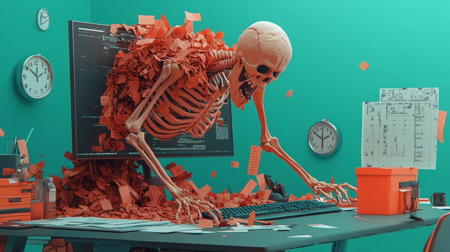
I’ve watched perfect comps implode on press and “simple” labels delay launches by months - not because the designers were bad, but because production was treated as an afterthought.
The difference between a portfolio piece and a product on a shelf is discipline.
Run the checklist. Get the proof. Own the handoff.
If you want to apply the same discipline to scope, responsibility, and delivery boundaries, make sure your process is backed by a clear pricing structure - because limits only work when they’re enforced.


