
Design isn’t just about looking good—it’s about being understood. While creativity is a strength, overdesign is its secret saboteur. When your brand tries to do too much visually, it sends mixed signals, overwhelms viewers, and—worst of all—erodes trust. Here’s how to strip back the chaos and let simplicity shine.
What Is Overdesign, Anyway?
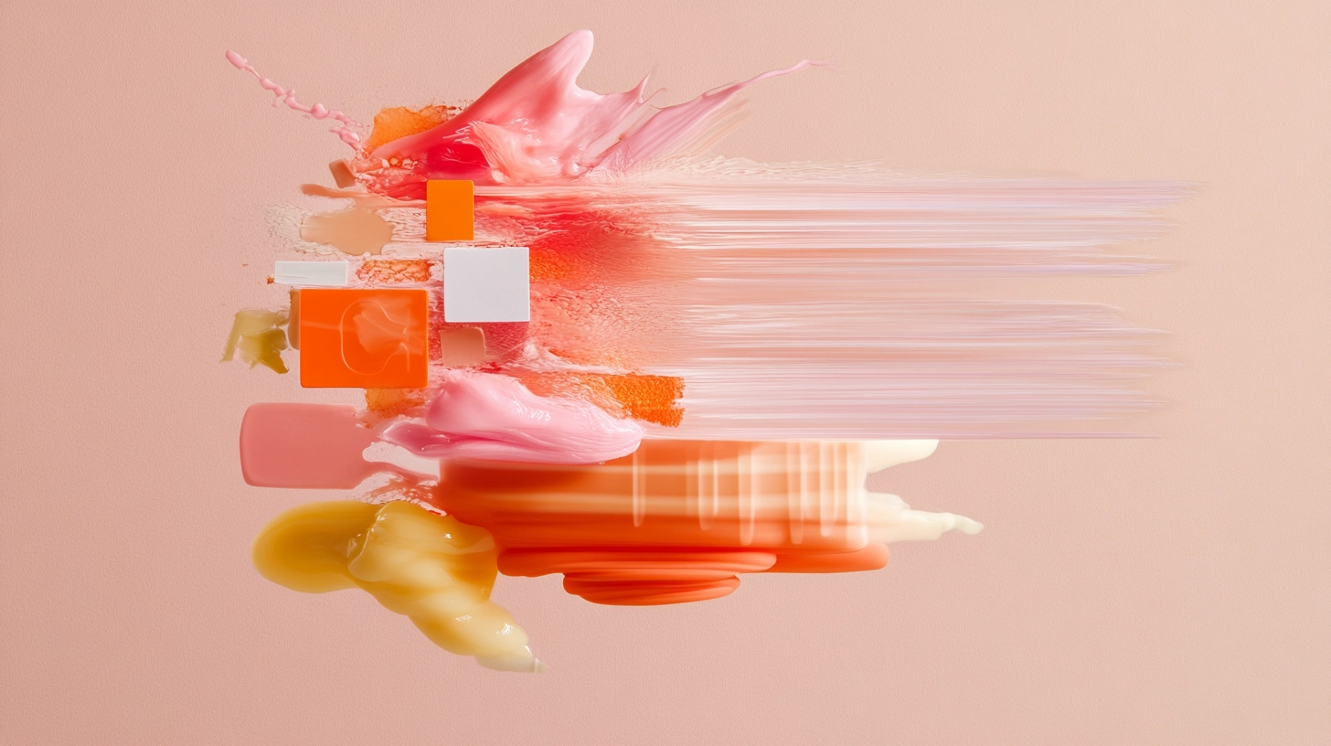
Overdesign isn’t just a riot of colors. It’s cluttered layouts, conflicting styles, an army of icons, wild fonts, and zero breathing room. In short: visual chaos.
- Too many elements competing for attention
- No clear visual hierarchy or focal point
- Gratuitous animations and transitions
- Fonts, icons, and colors applied without consistent rules
Translation: Your audience doesn’t know where to look—or why they should trust you. For clarity, explore our headers and banners gallery and see design simplicity in action.
Why Overdesign Kills Trust
Brains crave simplicity. When users can’t quickly process what they’re seeing, they bounce. Overdesign triggers cognitive overload, leading to:
- Anxiety and confusion
- Perceived unreliability
- Mental fatigue
- Rapid exits and low session times
By contrast, minimalist design—backed by a solid mockups collection—communicates professionalism and clarity. It feels like a steady hand guiding the user, not a circus act.
The Science of Simplicity
UX research consistently shows that simplicity yields better results: studies like power of simplicity in branding prove that clean, minimal brands win in cluttered markets.
- Higher Engagement: Clean layouts invite exploration.
- Better Recall: Fewer distractions mean stronger memory retention.
- Faster Decisions: Clear calls-to-action drive conversions.
How to Simplify Your Brand Without Looking Boring
- Embrace White Space & Grid Systems
Think of empty space as your secret weapon for focus. - Limit Your Palette
Choose two primary colors and one accent. Reserve that accent for CTAs or highlights—no more. - Standardize Typography
Stick to 2–3 typefaces max. Pair a strong headline font with a neutral body font. - Clarify Your CTAs
Give each button or link a distinct style: primary, secondary, tertiary.
Pro Tip: Test your new look in some office and stationery mockups to see how it carries over to real-world assets.
Design Audit: The 5-Second Test
Before you ship any asset, run your design through these checkpoints:
- Purpose: Does every element serve a clear function?
- Hierarchy: Is there an obvious path for the eye to follow?
- Messaging: Can someone grasp your core promise in under five seconds?
Fail one? Simplify until it passes. Explore our food template for clean product visuals.
Real-World Example: From Clutter to Clarity
A boutique consultancy relaunched its site after ditching neon gradients, five font families, and looping banners. They switched to a monochrome palette with a single accent color and standardized on two typefaces—from serif headers to sans-serif bodies. The result? Bounce rates dropped by 45% and time-on-page doubled.

Advanced Simplicity Tactics
- Progressive Disclosure: Reveal info only as needed—use accordions or “Read More” links.
- Consistent Iconography: Choose one icon style (line, filled, or duotone) and stick to it.
- Responsive Minimalism: Prioritize content differently on mobile vs. desktop.
- Microinteractions: Subtle hover effects that feel purposeful, not gratuitous.
Building Trust Through Simplicity
In a world of noise, simplicity is your megaphone. It tells users, “We value your time and attention.” It signals control, professionalism, and respect. By avoiding overdesign, you create a brand experience that feels coherent and trustworthy—exactly what today’s savvy audiences crave.
Conclusion: Simplicity = Strength
Overdesign may grab eyeballs, but it weakens your brand’s emotional handshake. Strip back the noise, focus on what matters, and design with intention. Because in branding, less truly is more.
Ready to build a high-trust brand with clean, focused design? Explore our package mockup and full search tool to simplify your visuals with confidence. For web design tips, check this design simplicity article.


