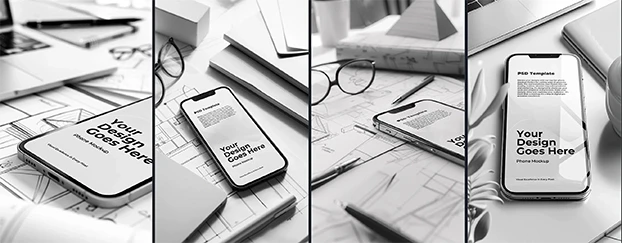
 When every brand leans on the same AI stock photos, the feed turns into a hall of mirrors. You see the same perfect smiles, the same soft lighting, the same aspirational kitchens. It’s fast - until your audience can’t tell you from everyone else. If you want scale without sameness, treat AI stock as raw material, then shape it with your brand’s cues using context-first mockups.
Why AI stock looks the same - and why that breaks branding
Most AI libraries optimize for median taste - safe, glossy, trend-shaped. Over time, that nudges teams toward a generic visual language that weakens recall and trust. The antidote is disciplined story-first design and constraints. Brand leaders are actively debating how to protect authenticity at scale - see authentic stories in the age of ai.
Before you pick images, anchor layouts and test concepts in device contexts like devices and tech to spot “stockiness” early.
The hidden UX tax: speed today, sameness tomorrow
Dropping a plausible stock image into your file feels productive. The tax arrives later, when campaigns blend into the background and you burn cycles manufacturing contrast. A cleaner path: prototype fast, then iterate for distinctiveness across surfaces. Lock typographic rhythm and hierarchy with modular templates so your brand voice doesn’t get pulled toward the average.
“Template brain” and the copy-paste effect
When teams choose assets mostly because they’re ready-to-use, brand cues drift. Fonts, color ratios, lens feel - even gestures - slide toward average. Flip the order: first lock layout and hierarchy, then pour imagery into it. Validate legibility, grain, and real-world feel on print surfaces like print materials so type, textures, and contrast hold up outside the Figma frame.
Yes - audiences can tell (and they care)
It’s not just designers noticing sameness. Summaries of recent studies suggest many consumers can detect AI-generated content, and that detection can dent credibility. Here’s a handy reference: consumers can detect ai generated content. If your visuals read as AI-stock, people assume the message is generic, too. The fix isn’t “no AI” - it’s AI with constraints and human finish.
A brand-safe workflow for using AI stock (without losing your edge)
1) Start from brand cues, not prompts.
Codify micro-signals: color ratios, lighting mood, lens feel, texture, motion language. Translate them into prompt constraints and retouch checklists. For wearable or merch checks that reveal pose/crease realism, stage designs on apparel.
2) Prototype in context, not isolation.
Move early studies into screen frames, packaging, and OOH to see if they help or hurt your story. A quick sweep through packaging exposes clichés - like the same three-quarter angle everyone ships.
3) Treat AI stock as a base layer - then brand it.
Grade toward your palette, add texture, and retouch lighting to your photographic language. For narrative-led surfaces, start from headers and banners so type scale, spacing, and rhythm stay on-brand while visuals rotate underneath.
A practical checklist to “de-stock” your AI stock
- Color & grade: push toward your palette; avoid vendor-default vibrance.
- Composition: break the “perfect center subject” trope; use asymmetry and meaningful negative space.
- Texture & realism: add micro-imperfections (paper tooth, scuffs, reflections) to cue a lived-in feel.
- Typography: keep brand fonts and consistent line lengths across banners and ad shells.
- Context swap: vet the same visual across screen, print, and packaging before approval.
- Diversity & inclusion: specify authentic communities and environments, not stereotypes.
- Licensing sanity: even with AI stock, confirm channel and region usage.
- Final smell test: at a glance, could a fan identify it as your brand?
 Where AI stock does make sense (and how to keep it authentic)
- Low-stakes surfaces (internal decks, concept boards) where speed outranks originality.
- Background roles where imagery supports message; re-grade to your palette and reduce AI sheen.
- Variant testing to learn which brand cues move metrics - use stock for the test, craft the final.
When you need seasonal stories at pace, start from seasonal and holiday to keep hierarchy consistent while tailoring visuals around it.
Find brand-safe visuals without losing your voice - start a focused search and filter by the cues that make your brand, yours.


