 You don’t need another doom post about burnout. You need a calmer way to ship. AI design tools can absolutely push you into overdrive - but used with intention, they become the guardrails that protect your focus, your energy, and your craft. This piece lays out a sustainable workflow you can actually keep, with concrete checkpoints, ethical guardrails, and templates that do the heavy lifting so you don’t have to.
The mindset shift: from “more output” to “right output”
The fastest way to burn out is to ask AI for everything. The sustainable path is narrower: let AI handle low-differentiation tasks (resizing, variant generation, technical mockups) while you reserve judgment, narrative, and taste for yourself. A good litmus test is whether the task benefits from standards and repetition. If yes, hand it to your tools; if not, keep it close.
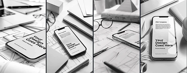
When you need standardized visual frames, start with focused mockups rather than blank canvases, so your choices stay bounded early. A curated library like mockups gives you structure before creativity kicks in, which shortens the messy middle without flattening your voice.
Guardrail 1: pre-design with constraints (templates as decisions, not suggestions)
If every project begins with a wall of possibilities, your attention erodes before you design a single pixel. Sustainable teams “pre-decide” 60–70% of a layout through reusable patterns. That’s what professionally built templates are for: they lock in rhythm, spacing, and hierarchy so your brain can focus on message.
Use a template set as your staging ground - campaign posters, packaging sleeves, social frames - then vary color, type, and assets where the brand breathes. A library like templates keeps the floor high while still letting you customize the ceiling.
Research note: Even in human-AI collaboration studies, teams that define structure before generation report less cognitive friction and more repeatable quality, as discussed in this ACM study on human AI collaboration that frames constraints as a way to reduce mental load.
Guardrail 2: standardize your preview layer (mockups by channel)
Context switching is a fatigue multiplier. Instead of rebuilding presentation frames per request, establish a preview layer - a fixed set of mockups tied to your core channels. For product drops, keep a trio at hand:
- Device frames for launch pages and UI reveals → devices and tech.
- For retail or events, use print materials to keep specs and dielines consistent.
- Apparel for merch or creator collabs, then tailor colors and placements to the collection.
Once this layer is standardized, “show me three options” becomes a one-click operation: swap the art, not the structure. That’s sustainable because you’re optimizing the system, not your Saturday.
Guardrail 3: automate the “dumb work,” ritualize the “smart work”
Sustainable creative work separates mechanical tasks from judgment calls. Batch the former, ritualize the latter.
Automate/batch
- Sizing sets, bleed/safe-area checks, and export presets
- Hero alternates and CTA placement variations through ready layouts like headers and banners
- Channel-specific crops for marketplace thumbnails and social shorts
Ritualize
- 20-minute “narrative pass” where you name the story before touching color
- 10-minute “taste pass” at the end to remove anything clever but unnecessary
- Weekly pruning: archive assets that no longer serve current brand arcs
This pattern honors the human-centric design tools idea: machines handle scale; you handle sense.
Guardrail 4: define ethical rails early (ownership, disclosure, and iteration logs)
Stress often spikes when teams are unclear about what’s “allowed.” Set rules up front - what’s fully original, what’s AI-assisted, what’s licensed - and log your choices. Clear lines reduce late-stage rework, which is a sneaky burnout driver.
For a perspective on how creative well-being ties to control and clarity in AI-enabled settings, a MDPI research on work design explains how autonomy and structure can co-exist without overburdening teams.
Guardrail 5: lock in asset families to avoid decision fatigue
Decision fatigue doesn’t come from big calls - it comes from a thousand micro-decisions that don’t matter. Commit to a small “family” of display frames across product, print, and packaging so everything you ship shares DNA:
- For e-commerce hero shots, keep a stable packaging frame and only vary lighting or angle.
- For offline collateral, standardize brochure and flyer scaffolds with print materials.
- For seasonal capsules, reuse your social frame sets instead of starting from zero with CreativeStock library breadth to keep things fresh.
Guardrail 6: use category-first search to cut the “scroll tax”
The longer you scroll, the more your attention bleeds. Start from the right aisle, not the global feed: open mockups, jump to devices and tech for UI, or apparel for DTC drops; then refine. Category-first navigation is a tiny habit that saves hours over a quarter. On a marketplace built for speed, the structure itself is doing part of your time-saving design workflow.
A sustainable week with AI design tools (sample cadence)
Monday - Framing: Define the story, pick the templates that match the campaign arc, and outline required derivatives by channel.
Tuesday - First pass: Generate core assets and place them into your fixed preview layer - devices and tech, print materials, apparel - to sanity-check.
Wednesday - Feedback window: Collect comments inside consistent frames, not random screenshots.
Thursday - Variant sprint: Use batch exports and your headers framework to generate channel-ready options via headers and banners.
Friday - Polish & ship: Run the taste pass, archive the excess, and prep a handoff packet.
Throughout the week, when you need something specific fast, jump to search with a tight query and limit yourself to one page of results - constraints protect energy as much as schedules.
What this article is - and isn’t
You may have read essays exploring why some designers burn out while others “build empires.” That’s a different conversation about incentives and ambition. This piece stays tactical: it’s not diagnosing burnout; it’s designing a workflow that makes over-functioning harder and focus easier. If you follow the guardrails - pre-decide structure with templates, standardize your preview layer with mockups, and keep ethical clarity - you’ll feel the shift in your calendar and your attention.
Quick starter kit (copy this into your Notion)
- System assets: one base packaging frame, one print materials frame, one devices and tech frame
- Channel assets: two headers and banners layouts for announcements and drops
- Rituals: narrative pass Monday 10:00, taste pass Friday 16:00
- Rules: document AI assist level per asset, keep ownership notes, and archive weekly
If you want a single place to source these components, a marketplace that blends templates and mockups reduces tool-hopping and keeps visual consistency across touchpoints, which is the whole point of sustainable creative ops.
Ready to work saner, not harder?
Test this workflow with a small campaign and build your preview layer using curated assets, then scale. If you’re not ready to commit, start with a few downloads from free and feel the difference in one sprint; if you already know you need this at volume, you can later switch to pricing without changing your system.
