We’ve all shipped a mockup that looked “fine”… until full screen. The good news: with a steady AI branding tool and a calm process, polish is predictable. In modern AI graphic design, speed doesn’t kill quality—rushing the little things does. Consider this a tour of the seven places mockups usually fall apart and the small, almost impolite tweaks that keep them together. Mild humor included; melodrama excluded.
1) Sharp Assets, Instant Authority
Blurry edges whisper “we did this in a hurry.” Viewers may not name the problem, but they’ll feel the price drop. Clean pixels are confidence on contact.
What works: start from well-made source files with tidy Smart Objects and enough native detail to survive a 100% zoom. If you need breadth fast, reach for curated mockups and save yourself the archaeology of fixing mushy PPI. Clients don’t zoom in—until they do.
2) Light That Tells the Truth
Our eyes are ruthless. If highlights, shadows, and color temperature don’t agree with the scene, the brain raises a small, polite red flag labeled “fake.”
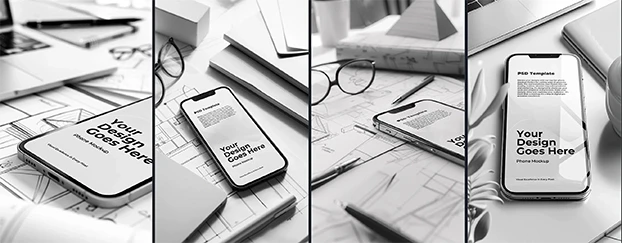
What works: pick the dominant light source, then make your art obey it. Add quiet contact shadows, keep reflections directional, and avoid glow-stick halos. For screen work, lean on realistic device & tech mockups—the reflections and bloom are already doing you a favor.
3) True Proportions, Zero Distortion
Stretched logos read like they’ve taken a roller-coaster lap. Curved surfaces, angled planes, soft materials—each needs its own kind of respect.
What works: scale vectors inside the Smart Object, not on the canvas; let displacement/warp live where the template expects it. If edges stay crisp and letterforms look like themselves, you’re winning. If your “O” becomes an oval, it’s a cry for help.
4) Context That Sells the Message
Great identity in the wrong room is a networking event gone sideways. Minimal skincare in a neon confetti storm? Fun, but not premium. Serious fintech on a picnic blanket? We have questions.
What works: match scene to strategy. Corporate materials like calm desks and clean light; lifestyle brands prefer tactile props and soft daylight. When uncertain, use restrained print materials or neutral surfaces. If the environment still feels like your brand with the logo covered, you nailed it.
5) Scene Supports, Brand Leads
The mockup is the stagehand, not the headliner. Over-styled backgrounds and novelty props look loud in the moment and forgettable a week later.
What works: keep the story centered on shape, type, and palette. A reliable AI branding tool helps you lock typography and color so every frame lands inside the same family. Consistency is the shortest route to “this looks expensive.”
6) Diverse Templates, Credible Work
Same angle, same hand, same desk: it’s a look—just not the one you want. Repetition whispers that the template is in charge.
What works: rotate formats (device, print, packaging) and viewpoints (flat-lay, lifestyle, tight crops). Keep a “go-to five,” but swap two per project to avoid déjà vu. When deadlines bite, use focused search queries to find fresh scenes that stay on-brand without detours.
7) The QA Ritual (Five Minutes, Fewer Surprises)
Last-mile errors are small until a stakeholder projector makes them large. The cure is short, repeatable, and slightly boring—exactly what saves launches.
What works: zoom to 100–200%, toggle on dark and light backgrounds, test on phone and laptop, blink at the edges for halos and banding, then walk away for ten minutes and do one more pass. You’ll catch more than you think, and none of it will be heroic.
Putting It All Together: A Calm, Fast Workflow
- Pick the scene with intent: What should the viewer remember—product, interface, or material? Choose accordingly. If you’re bridging digital and print, pair a clean screen with understated stationery; they flatter each other.
- Place artwork the polite way: vectors inside Smart Objects, perspective handled by the template, no freehand stretching. Your future self says thanks.
- Make reality plausible: align light, add contact shadows, tame color casts. Subtle is the superpower.
- Align to brand: typography hierarchy, palette, contrast, and voice. If three slides feel like cousins, not strangers, you’re there.
- QA and export on purpose: screen sizes for web, a CMYK-ready variant if print is looming, and filenames that won’t make you blush later.
Need both breadth and consistency across touchpoints? Start broad with curated mockups, add a couple of screen-forward frames from devices & tech, and close with one restrained print composition. That arc reads like a product that exists in the real world—because your presentation does.
Why This Approach Works
Polish isn’t a miracle; it’s a pile of small rules followed on time. Sharp assets signal care, believable light earns trust, proportion respects the design, and context sets the agenda. With an efficient mix of mockup design, editable mockup templates, and a trustworthy ai mockup generator, an AI branding tool becomes less of a “shortcut” and more of a seatbelt—you move faster and arrive looking composed.
Wrap-Up: Subtlety Wins, Consistency Sells
No cape required. Keep pixels crisp, make the light honest, let the brand lead, and repeat a tiny QA ritual that never makes headlines. The result: mockups that feel expensive, approvals that land quicker, and a story that stays intact from slide one to sign-off.

