When every headline, caption, and CTA share the same typeface, you don’t get “minimal.” You get monotone. Real minimalism is disciplined hierarchy, not starving your brand of voice. The upside: AI branding tools plus systemized assets make it easy to build typographic range without chaos or bloated timelines. Below is a fast, practical path to move from flat to credible—paired with on-brand internal resources you can plug in today.
The “clean look” that quietly cheapens trust
One font across everything flattens emphasis: headlines stop leading, subheads stop guiding, CTAs stop pulling. Your story turns into a monotone announcement. Start by pairing a characterful display font with a stable text face, then lock the hierarchy (H1/H2/H3/body/caption) into reusable components.
If you want a quick refresher on fundamentals that impact readability and UX outcomes, this overview from Interaction Design Foundation—The UX Designer’s Guide to Typography—is a solid primer. Then browse the structured collections in Templates and Mockups for instant starting points—each set is designed to carry hierarchy across formats. Or reset your bearings from the Home page.
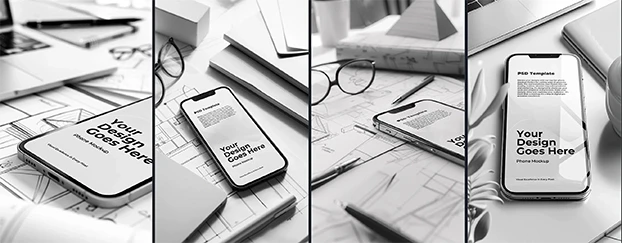
Stress-test your next headline style on real surfaces using Mockups.
“Minimalist” ≠ no hierarchy: bring order, not emptiness
Minimal design isn’t about stripping features; it’s about clarifying signals. That means:
- A modular type scale (e.g., 1.250 ratio) for H1 → caption
- Line-length discipline (roughly 55–75 characters for body)
- Intentional letter-spacing on display styles
- Clear roles: display = emotion; text = endurance; CTA = velocity
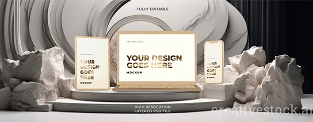
To see how your rules behave on devices, drop your layout into Devices & Tech mockups for instant, no-photoshoot previews. If you’re validating a brand concept on a budget, spin up a few page sections with Templates, then render them on screens or packaging.
Get a reality check on legibility with Devices & Tech mockups.

Let the system do the heavy lifting: AI template workflows
This isn’t “cheating”; it’s compounding. An AI template bakes in baseline grids, typographic rhythm, and spacing tokens so your choices stay consistent from hero to footer. You adjust variables (font family, sizes, leading, color) once, then propagate that logic across use-cases.
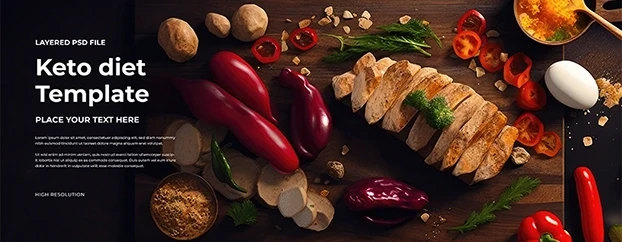
Need quick social, ads, or email modules? Start with category-ready Templates and you’ll dial typography while keeping layout integrity. When you’re testing brand tone for retail, marry those templates with realistic surfaces—packaging, labels, sleeves—so you’re evaluating type where it will actually live.
Move fast with pre-built section patterns in Templates.
From guesswork to proof: validate with contextual mockups
Typography judged in a vacuum lies. Context exposes whether contrast, scale, and weight truly land. Render the same headline and body copy across screens, posters, and boxes to see how hierarchy flexes. For display-heavy work like event promos or OOH, these practical tips—Ways to Manipulate Text in Poster Designing—can help you pressure-test drama without sacrificing clarity.
- Digital? Use Devices & Tech mockups for multi-viewport checks.
- Retail or D2C? Test label stacks, nutrition tables, and tiny disclaimers with packaging scenes (start from the full Mockups hub).
- Seasonal campaigns? Lock a promotional display style, then cascade to modular social units via Templates.
If you’re still shaping the core system, prototype risk-free using the Free library before rolling out to your full asset kit.
Prototype with zero commitment using Free assets.
Practical type rehab: a 72-hour sprint
Day 1 — Define roles.
Choose a display face for emotional headlines and a text face for long-form. Create a scale for H1/H2/H3/body/caption. Wire it into a base page using Templates.
Day 2 — Context checks.
Export 3–5 key layouts and render in Devices & Tech mockups (product page, landing hero, email). Adjust weight, tracking, and contrast based on live previews.
Day 3 — Systemize and roll out.
Document rules (sizes, line-height, spacing, do/don’t). Build a small component set (hero, card, list, CTA strip) and test a seasonal variant using Templates: Seasonal & Holiday or content-led blocks like Templates: Headers & Banners. When ready to scale, compare plans on Pricing and keep growing via site-wide Search.
Lock the base system today; expand tomorrow—start in Templates: Headers & Banners.

One font = one voice. Your brand needs a choir—disciplined.
A single typeface can’t carry all situations. Give your brand a primary voice (display), a dependable narrator (text), and a clear closer (CTA). With AI branding tools embedded in reusable Templates and validated via Mockups, you move from “clean but bland” to “sharp and credible”—without adding chaos to your workflow.
Try a lean build with Free, then scale your system when it proves itself via Pricing.