![]()
You want the truth from a senior designer who’s shipped more deadlines than you’ve named files “final_v7”? Most “creative ruts” aren’t about talent - they’re about staring at a blank artboard while the clock hisses. Real pros hack momentum. And the fastest way is starting inside Creative Stock. With creative stock, I can grab credible scenes, drop in my content, and have something worth critiquing before the junior team finishes naming their Figma frames. That’s not cheating; that’s called using your brain (and your budget) wisely.
Stop waiting for the muses - prototype with context
If you’re pitching concepts with wireframes and adjectives, no wonder stakeholders don’t “get it.” Show, don’t tell. Start with the mockups library and put your UI, key visual, or mark into real environments. If you need a refresher on what a mockup is and why it matters in the design process, skim this concise overview of mockups and then get back to work. It’s instant signal: lighting, scale, and material do the heavy lifting so you can discuss message and hierarchy like adults. Build three distinct variations - different crops, angles, and focal points - and force the conversation to be about ideas, not “can you imagine it?” If you present one option, you’re begging for twenty revisions; present three, and you’re negotiating like a pro.
Pro move: export a quick 2×2 grid for each route; at thumbnail size, weak options reveal themselves.
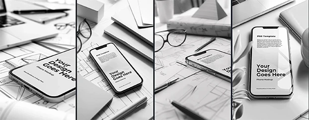
Templates aren’t training wheels - they’re traction
Opening a blank file every time isn’t “craft”; it’s ego. Lock in rhythm, spacing, and a sane typographic system from minute one with templates. Then iterate: swap brand colors, adjust type scale, replace images, and throw down your headline. Because these bases are refined by designers, you spend energy on story and conversion rather than babysitting margins. Build three passes - safe, bold, experimental - off the same foundation. You’ll read stakeholder appetite in ten minutes instead of ten meetings.
Tip: keep one message per frame. Grids love clarity - and so do clients.
Make software look like it exists (because it should)
Floating UI on a white void kills credibility. Put it in hardware. The Devices & Tech collection gives you photoreal phones, tablets, and laptops with believable reflections and depth. Suddenly your SaaS hero looks like a product, not a figment. Use tight crops for detail where you want the eye to stick, and wide angles to tell a story across screens. If you want an outside perspective on practical habits, this guide to using mockups effectively mirrors what I tell juniors daily: decide at a glance, not after a 40-slide deck. High-resolution mockups let you push to billboard - or just dominate a landing page - without the “did we shoot that?” budget.
Checklist for juniors: one straight-on hero, one angled shot, one lifestyle context. If the trio reads, the page will too.
Make it tangible (put your work in the real world)
You’re not done when the layout looks tidy on screen - you’re done when it reads like something that could land on someone’s desk or wall. This is where I grab a few scenes from Print Materials and drop in the logo, headline, and a supporting visual. Keep the light and surface consistent so it feels like a set, not a collage. The point isn’t to impress with clever textures; it’s to give stakeholders that quiet, physical “oh, this exists” moment. Think letterhead + card + folded piece, all aligned in tone. Now we’re discussing message hierarchy and brand posture - not whether a mockup looks fake.
Reality check: if your headline doesn’t sing on paper, it won’t sing in pixels either.
Pressure-test physical touchpoints (before you order anything)
If your concept will live on fabric or a box, validate it at thumbnail size before you throw money at samples. I’ll spin up two or three looks with Apparel to check placement, scale, and colorways, then a hero angle that stress-tests label legibility. When packaging is the stage, a single decisive product shot beats 40 slides of theory - especially when you’ve sanity-checked it against the realities of a shelf. If it doesn’t read small, it won’t sell on a PDP. Make the decision cheap; make the learning fast.
Rule: judge everything on mobile first. If you can’t read it while walking, you won’t convert when they’re scrolling.
The quiet cred you’re skipping: everyday context
Not every brand lives on a billboard. Often the most persuasive visual is a letter on a desk, a notebook by a laptop, a pen casting a natural shadow - quiet context that says, “This brand operates in the real world.” The Office & Stationery collection delivers that understated legitimacy. Use it for case studies, B2B one-pagers, and those “We’re hiring” posts that shouldn’t look like a carnival. Sequence a mini-narrative: desk wide shot, device close-up, printed leave-behind. Subtle, coherent, adult.
Designer note: match light temperature across frames. Cohesion reads as confidence.
Don’t “search the internet.” Search like a designer.
If your research looks like endless scrolling, you’re doing it wrong. Search inside the tool where assets are already curated. Use Search with smart terms (material, angle, surface, time of day), then filter to three contenders. Commit to one, duplicate, iterate, compare. That’s a time-saving design workflow: fewer tabs, more traction. It’s not about finding the perfect file - it’s about finding a professional starting point you can critique without apologizing.
Frame it this way in reviews: “Which tells the story better?” not “Which one do you like?”
Rules for juniors who want senior results (without the gray hair)
- Start with context, not vibes. If it’s UI, show it in hardware; if it’s brand, show it on surfaces; if it’s merch, show it on bodies. Assets from creative stock are your rehearsal space where bad ideas die quickly and good ones get louder.
- Decide at thumbnail size. Most audiences meet your work in a feed or grid. If it doesn’t read small, it won’t read at all.
- Version ruthlessly. Three routes minimum. Keep lighting and perspective consistent so debate stays about ideas, not optics.
- Name your files like you respect future you. “Hero-A_Bold” beats “final2_final_new.psd.”
- Ship something. Perfect is expensive. Shipped is data. The market is your best IA and your cheapest QA.
What “AI design tools” actually fix (and what they don’t)
AI won’t write your strategy or choose your promise. What it will do is obliterate the friction between idea and believable preview. Inside creative stock, the AI-generated, designer-refined scenes make iteration cheap and clarity fast. That shifts your effort from production to decision-making - the grown-up part of design that wins outcomes, not dribbles. You weren’t hired to fuss with shadows; you were hired to move people.
If you still think this is “cheating,” enjoy your next week waiting on a prototype while someone else ships.
If you’re serious about replacing blank-page panic with repeatable wins, start building a reusable library today. Grab a starter kit from the Free section and let your next presentation argue for itself.