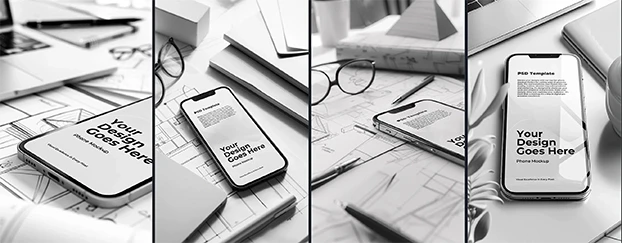
Creative stock has exploded - libraries are bigger than ever, clients expect same-day visuals, and deadlines keep shrinking. Yet many teams still end up wrestling with filter stacks to rescue assets that don’t feel believable. This article gets practical about the gap between volume and quality: what recent reporting says about today’s stock landscape, why “quick fixes” rarely fix structural flaws, and how to build a faster, brand-safe workflow with premium mockups and customizable templates.
If creative stock is supposed to save time, your process should reflect that - less scrolling, fewer patch-jobs, more marketing-ready results. For a benchmark of “usable,” start with the curated selection on the CreativeStock marketplace.
The stock crisis is real, not just vibes
Let’s start with receipts - ideally from outside our own bubble. Creative Bloq captures the mood bluntly, quoting designers who say “a deluge of AI slop is making it harder to find decent images.” The piece details how exclude filters and endless pagination still bury quality beneath noise. Read the coverage here: designer frustration with AI-flooded stock libraries.
If you can’t trust a generic feed to surface usable results quickly, the advantage won’t come from another LUT - it’ll come from better inputs chosen before you open Photoshop. For controlled lighting, stable perspective, and realistic materials, browse premium mockups instead of gambling on whatever floats to the top of a crowded search page.
Don’t hunt for needles—start from vetted scenes.
Why filters can’t rescue flawed inputs
Filters polish exposure and color; they don’t fix physics. Warped labels, impossible reflections, rubbery shadows, and uncanny hands are not “grade-it-away” problems. The more low-quality, AI-generated assets seep into your workflow, the more you’re polishing artifacts instead of designing. The smarter move is to begin with sources that already respect brand constraints - typography grids, dielines, believable materials - so your time shifts to hierarchy, copy, and campaign rhythm, not cleanup. That’s why teams standardize on customizable templates that slot into real brand systems; then your “filtering” becomes the last 5% of finishing, not a two-hour triage.
Make filters optional, not mandatory.
When infinite choice slows you down
“Infinite” catalogs sound empowering until the deadline is this afternoon. CineD quantified what many of us felt anecdotally: as of April 8, 2025, 47.85% of all images on Adobe Stock were AI-generated - nearly half the catalog. That’s volume rising without a guaranteed boost to signal-to-noise. See the analysis here: nearly half of Adobe Stock is AI-generated. More pages to scroll means more time lost to near-duplicates and uncanny details that crumble under scrutiny. Tighten your funnel by committing to channel-specific choices early. If the deliverable is a product hero on a device, skip the haystack and work from Devices & Tech mockups so UI edges read crisply at hero and secondary sizes.
Treat search like targeting - tight, not trendy.
A saner, faster workflow (from concept to launch)
Here’s a repeatable flow that cuts guesswork and preserves quality:
- Start with the right base. Pick a channel-ready layout from customizable templates; swap brand tokens (type, color, logo) so consistency is baked in from minute one.
- Preview in environment. Validate legibility and contrast using Devices & Tech scenes; correct optics and reflections make UI decisions clearer.
- Stress-test print. For brochures or flyers, verify paper weight, fiber detail, and ink density with Print Materials mockups - if headlines look muddy here, they’ll look muddy at the printer.
- Lock apparel sizing. Merch fails when artwork warps. Confirm print zones and stitch interactions using Apparel mockups before placing orders or seeding influencers.
- Simulate shelf impact. Packaging wins on material cues - matte vs. gloss, micro-scratches, shadow falloff. Use Packaging mockups to test front-panel hierarchy and variant differentiation at realistic sizes.
- Prototype for free, then scale. If stakeholders need a taste before committing, start with free assets to validate direction, then upgrade to premium scenes once a concept sticks.
- Align budget to cadence. Map publishing frequency to credits; lock the right plan via Pricing so procurement doesn’t derail approvals later.
Prototype today; present believable options tomorrow.
Quality, not quantity: what clients actually notice
Clients don’t audit your layer stack; they notice whether the visual reads as real and on-brand. That’s why high-resolution scenes with correct shadow falloff and plausible reflections matter more than 40 similar angles that still feel synthetic. When your source scenes are consistent, everything tightens: headlines snap into place, CTAs pop without looking radioactive, and palettes don’t drift under odd lighting models. If your team ships weekly creative, formalize a “known-good” library across devices, packaging, and print. Document export settings, preferred focal lengths, and scale ranges; the next brief becomes assembly from trustworthy parts rather than reinvention. And when you do need stock, begin with a curated base of premium mockups instead of a random search slog.
Consistency builds trust - engineer it into your scene kit.
The hard truth: AI isn’t the enemy - bad inputs are
AI is a tool; low-quality inputs are the risk. Speed tempts teams into assets that collapse under scrutiny. Designers win by controlling context - choosing scenes and templates that honor brand physics - and applying human judgment where AI is weakest (hierarchy, tone, authenticity). To keep momentum without relying on questionable feeds, refine discovery with intent-driven keywords on CreativeStock Search and assemble from vetted categories you’ve already standardized in your workflow.
Protect your brand - choose inputs that honor physics and typography.
Where to point your next sprint
- Landing page hero + device UI: Maintain angle consistency across breakpoints; check glass reflections and edge contrast before design lock.
- Retail leave-behinds / brochures: Validate folds and ink density during pre-press checks to avoid late-stage surprises.
- Merch or uniform refresh: Confirm print zones to prevent stretch artifacts on curved surfaces.
- CPG shelf test: Stress-test hierarchy and variant legibility at 30–50% scale before rollout.
- Budgeting: Align cadence and credits early so approvals aren’t derailed by procurement.
Plan by channel; select scenes before you write copy.
Final word: less crying, more creating
Creative stock is here - and so is the flood. The fix isn’t another filter stack; it’s better inputs: assets that respect light, geometry, and brand reality before you touch them. Combine curated premium mockups and ready-to-use templates with a lean, repeatable flow. Scale confidently with the plan that fits your cadence via Pricing. Your comps will read as human - and you’ll ship faster.
Validate direction fast with free assets, then lock your scene kit and move from concept to launch in hours - not weeks.


