AI Graphic Design: Avoid Inconsistency
Great brands aren’t built on luck—they’re built on consistency. But one silent, devastating mistake can unravel your visual identity: inconsistency across touchpoints.
What Does Inconsistency Look Like?
It’s not just mismatched colors. It’s micro-confusion that builds macro-doubt.
- Different logo versions across platforms
- Inconsistent tone, typography, and color usage
- Random spacing, sizing, or visual hierarchy
- Unclear visual rhythm between digital and print assets
Result: Clients subconsciously question your credibility.
Why It Hurts More Than You Think
Your audience doesn’t need to spot these issues to feel them. Brains notice harmony. Disjointed branding creates discomfort—even if they can’t say why.
- Shorter time-on-site
- Lower engagement
- Reduced conversion rates
- Decreased brand recall
The Fix: Build a Visual Identity Playbook
To stay consistent, your brand needs structure, not improvisation. Start with:
- Logo usage rules
- Defined color palettes with hex codes
- Font hierarchy for web, mobile, and print
- Image treatments and layout guides
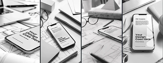
Pro tip: Validate with branding templates and print material mockups.
Scale It: Audit Your Brand Like a System
- Website header aligned with Instagram visuals?
- Consistent email signatures and pitch decks?
- App UI match packaging mockups?
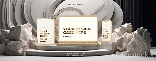
Tool Tip: Organize assets in folders with office and stationary mockups or locked brand kits.

Conclusion: Consistency Isn’t Boring—It’s Brand-Building
Disjointed visuals don’t just look messy—they feel unreliable. Unified branding boosts engagement, retention, and trust.
Before chasing trends, check your foundation. One frayed thread, and the whole brand can unravel.
Need brand-safe templates and mockups?
Get instant access to consistency-boosting design tools at CreativeStock.ai