
You could have a breathtaking color palette, stunning visuals, and next-level layouts—and still lose the room because your type is a mess. Typography isn’t decoration. It’s design’s voice. Get it wrong, and your brand sounds confusing, cheap, or completely untrustworthy. In AI graphic design, visitors decide in seconds whether to scroll, click, or bounce. Follow these four fixable missteps to ensure your text speaks confidently and converts every time.
1. Misaligned Hierarchy
Fonts need roles. If your headings, subheads, and body copy all share the same weight and size, users don’t know where to start. A scrambled hierarchy pulls attention in conflicting directions, causing readers to skim past your main message and CTA—driving up bounce rates.
Wreckage:
- Clients skim past your CTA button altogether
- Users feel overwhelmed and leave without engaging
Fix It:
- Use consistent weight and size differences: establish H1, H2, H3 patterns.
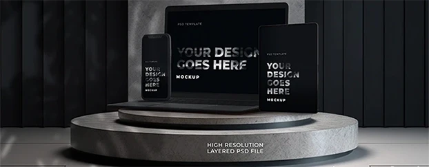
- Implement a three-tier type system across all screens—it’s easy with editable mockup templates.
2. Bad Kerning and Leading
Tiny gaps can lead to big problems. Poor kerning (letter spacing) and leading (line height) break reading flow—and scream amateur hour.
Red Flags:
- Letters too tight or too wide, especially in ALL-CAPS headers
- Lines that feel cramped or floaty, making paragraphs hard to scan
Fix It:
- Check ALL-CAPS combos manually and adjust kerning in your AI mockup generator.
- Use a line-height between 1.4–1.6x for most body text to improve readability—preview across devices with our design mockup download.
 3. Font FOMO
Just because a font is trending on social media doesn’t mean it’s right for your brand. Font FOMO leads to inconsistent tone, slow load times, and licensing headaches.
Why It Wrecks:
- Random font swaps break brand consistency
- Style over readability frustrates users
Fix It:
- Shortlist two complementary families—one for headlines, one for body.
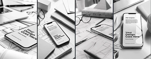
- Pressure-test combos in drag and drop design mockup scenarios using Print-Materials Mockups.
4. Inaccessible Font Choices
Your design must work for everyone—not just people with perfect vision. Ignoring accessibility alienates potential customers and risks compliance issues.
Common Mistakes:
- Light grey text on white backgrounds
- Ultra-thin scripts that vanish at small sizes
- Copy over busy images without contrast
Fix It:
- Follow WCAG contrast guidelines—minimum 4.5:1 for normal text.
- Use free assets and previews on CreativeStock.ai to test light and dark modes before launch.

Conclusion: Your Fonts Speak Before You Do
Typography is a trust signal. Done right, it whispers "premium" even before users read a testimonial. Done wrong, it screams "DIY experiment." Polish your hierarchy, fine-tune spacing, and run every design through professional mockups—then watch the rest of your system click into place.