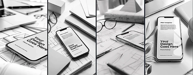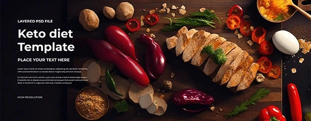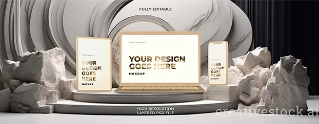
If you’ve ever crawled out of a three-day sprint held together by espresso and optimism, this one’s for you. With Creative Stock, the grindy parts of production vanish: you preview ideas on believable surfaces, lock typography into proven systems, and deliver client-ready routes before lunch. The shift is so dramatic that many teams report a “whoa” moment the first time they ship a polished concept in minutes. To set yourself up for the same experience, start from the source of truth on the Creative Stock homepage so every brief begins with a clear map of what’s possible.
The 3-Minute Workflow (No Panic Required)
1) Start from context, not a blank canvas. Your first comp should already look presentable. That’s the point of curated, photo-real scenes: they start at “client-believable,” not “rough blockout.” Browse the focused Mockups category and filter by device, packaging, apparel, or print to find an immediate match for your concept. If you’ve ever rolled your eyes at a list of things designers absolutely hate, this step deletes several of those pain points outright.
2) Search like a pro under pressure. Precise queries equal calm. Keep a tab pinned to the visual-aware Search and combine nouns with style cues - “matte pouch, minimal,” “folded A4, editorial,” “edge-to-edge phone, glossy” - to land exactly where the brief points.
Believability Wins: Why Clients Approve Faster
Stakeholders approve what they can see. If you’re showing an interface, put it on realistic hardware so your UX feels like a launch preview - accurate reflections, true proportions, no uncanny valley. Pull crisp device scenes from Devices & Tech mockups and your deck immediately reads as “real.”
The same trick works for physical products. Packaging decisions get faster when you can swap finishes and labels on photo-real surfaces. Test claims, colors, and materials without waiting on a print house by validating concepts inside Packaging mockups. In minutes, you’ll know whether the colorway pops or the claim line needs breathing room.
Rollout Without Reinventing
Once the core idea lands, the next win is distribution. Headlines and promos need canvases built for performance and scale - leaderboards, skyscrapers, social headers, seasonal placements. Keep rhythm consistent while you adapt copy by using Headers & Banners. Because the underlying grid and spacing are already dialed, approvals move on message clarity instead of layout surgery.
A 30-Minute Sprint You Can Steal
Minute 0-5 - Define the promise. One benefit, one CTA, one visual hook. If you can’t summarize the story in a single sentence, you’re not ready to design.
Minute 5-10 - Choose the hero surface. Is the moment digital or retail? A landing-page hero, an app walkthrough, a shelf confrontation, a poster in context - pick the scene that proves the point fastest.
Minute 10-18 - Build the first route. Drop your message into a strong structure and tweak hierarchy, contrast, and spacing. Show it on a believable surface so feedback stays specific (“tighten leading on the H1,” “give the label more air”).
Minute 18-24 - Spin a counter-route. Keep the headline, change tone: clean studio vs. lifestyle street; bright optimism vs. premium restraint. Because your surfaces and structure are set, you can explore narrative without rebuilding the world.
Minute 24-30 - Validate risk-free. If procurement isn’t ready or you’re proving the workflow to stakeholders, start with the curated starter library rather than committing spend on day one.
The Real Upsides (Beyond “It’s Faster”)
- Instant previews reduce risk. Seeing ideas where they’ll actually live prevents the “looked fine in Figma, died on shelf” fiasco. Grab a few tests from the Free section and you’ll spot weak routes early.
- Time-saving workflow. Reuse structure; spend energy on copy, contrast, and narrative - the parts that move outcomes.
- Scalable experimentation. Iterate claims and colorways without booking studio time or chasing renders.
- Library hygiene matters. If you’re building shared libraries, these Adobe Stock Libraries productivity practices show how structure multiplies speed.
For Agencies, In-House Teams, and Solo Founders
Agencies protect margin by shifting junior hours from perspective fixes to strategy. In-house teams replace “urgent” all-nighters with predictable pulls from an organized library. Solo founders finally get that agency-grade coherence - consistent type and believable context - without burning weekends. When you’re ready to extend a look across channels without rebuilding, lean on Templates for systemized type, spacing, and rhythm.
Final Take: Calm Is a Competitive Advantage
Deadlines didn’t get nicer; your toolchain got kinder. Walk into reviews with proofs that look like launch day, and feedback stays strategic. If you run only one experiment this week, do this: pick a hero surface, lock the message into a reliable structure, search for two tonal variations, and ship a believable proof. Ready to scale this beyond a one-off? Compare plans and keep momentum via clear, transparent Pricing.


