
Rumors of design’s demise are… entertaining. Tools are faster, sure. But tools don’t care about meaning, timing, or restraint. AI templates cut production time and keep layouts consistent; you still supply the story, the taste, and the call that turns assets into outcomes. In this guide, we’ll turn the “AI replaces designers” drama into a practical system—using templates, mockup design, and measured A/B testing—to ship sharper work in hours, not weeks.
What automation actually replaces (and what it never will)
Automates well: repetitive resizing, batch exports, variant generation, enforcing grids, and turning “blank page” into a sensible starting point.
Still human-only: narrative coherence, prioritizing trade-offs, cultural context, and the fine line between bold and try-hard.
For a balanced big-picture read (minus the panic), check Coursera’s explainer on where AI fits for designers.
Try this now: kickstart structure with Browse design templates and add content, not chaos.
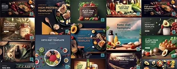
From zero to layout: build on AI templates, not vibes
A blank canvas invites dithering. Templates plus generation invite momentum.
- Lock hierarchy first. Drop headlines, body, and CTAs into Header & banner templates.
- Generate options, not answers. Spin 3–5 plausible looks with your copy and brand token set.
- Decide with criteria. At minimum: read distance, CTA clarity, and product legibility.
Once your scaffolding holds, map variants for promos with Seasonal promo templates. You’ll ship on time and on message.
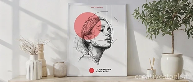
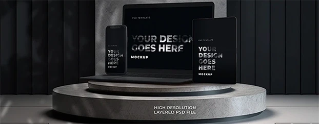
Proof beats opinion: preview ideas in real contexts
Most arguments die the moment an idea lands on a real object. Skip mood-board hypotheticals; run context checks.
- Campaign pitch: throw the headline into Poster & billboard mockups to judge hierarchy at a glance.
- E-commerce launch: test two type scales on Product packaging mockups: shelf readability decides the winner.
- App/UI: validate spacing and tap targets with Device screen previews.
If you need the full playground, explore All mockup categories and build the exact scene your stakeholders understand.
The three-role type system that keeps brands coherent
Design collapses when one font does every job. Assign roles:
- Display (character): headlines, hero lines, campaign moments.
- Text (readability): paragraphs, product details, FAQs.
- Utility (action): buttons, price chips, labels.
Wire the system inside AI templates so the team reuses scales and spacing, not “best guesses.” Then evaluate in print contexts via Real-world print tests before you commit budget.
A practical workflow that protects taste while speeding output
- Write the one-sentence goal. If everything is important, nothing converts.
- Structure with templates. Start with Explore reusable layouts and block the message, then decorate.
- Generate 3–5 looks. Useful variety beats infinite noise. Label why each might win.
- Run context previews. Use Mobile & desktop mockups to spot crowding, tangents, and low-contrast mistakes.
- Pick with criteria, not vibes. Which version makes the CTA unmissable and the product unmistakable?
- Package and reuse. Freeze wins into your kit; next time becomes drag-and-drop instead of ground zero.
Where AI shines—and where it doesn’t
Superpowers you can bank on:
- Speed: concept → testable asset in hours.
- Scale: size matrices (story post → hero banner → OOH) without relaying everything.
- Consistency: grid, spacing, and type scale enforcement across dozens of deliverables.
Limits worth respecting
- Original taste: recombination is not authorship.
- Contextual judgment: culture, timing, and business reality.
- Restraint: knowing when not to add the extra flourish.
For a pulse on industry sentiment, a 2025 survey summarized in Creative Boom’s report captures where teams see risk—and where they see leverage.
When you’re scaling a campaign across channels, start at See every mockup type to keep surfaces aligned.

Common traps (and quick fixes)
Trap: One typeface everywhere—everything feels “medium.”
Fix: Map Display/Text/Utility, then validate in Print-ready scenes for distance and contrast.
Trap: Social layouts that die at thumbnail size.
Fix: Build with Rapid banner layouts and check at 100% and 10% zoom.
Trap: Beautiful packaging that fails on shelf.
Fix: Use Shelf-view packaging tests; legibility beats filigree.
Trap: Stakeholders arguing hypotheticals.
Fix: Drop all options into App UI mockup scenes and vote with evidence.
Quick checklist: human-centered speed
- Anchor the message first; design follows.
- Build on AI templates to avoid layout busywork.
- Generate a small set of strong options.
- Preview in real contexts, not in your head.
- Lock a reusable kit; future assets should take minutes.
Ready to test without risk? Start with Start with free mockups. When the system pays back, Compare plans and scale.